Angular HtmlEditor Properties
This section describes properties that configure the HtmlEditor UI component's contents, behavior, and appearance.
See Also
accessKey
Specifies the shortcut key that sets focus on the UI component.
The value of this property will be passed to the accesskey attribute of the HTML element that underlies the UI component.
activeStateEnabled
Specifies whether the UI component changes its visual state as a result of user interaction.
The UI component switches to the active state when users press down the primary mouse button. When this property is set to true, the CSS rules for the active state apply. You can change these rules to customize the component.
Use this property when you display the component on a platform whose guidelines include the active state change for UI components.
aiIntegration
Binds the AI service to the HTML Editor.
To activate AI functionality in HTML Editor, specify:
- AIIntegration class
- 'ai' toolbar item
jQuery
const aiIntegration = new DevExpress.aiIntegration(provider);

$("#htmlEditor").dxHtmlEditor({
    // ...
    aiIntegration,
    toolbar: {
        items: [
            {
                name: 'ai',
                commands: [
                    'summarize',
                    'translate',
                    'askAI',
                ],
            },
        ],
    }
});
<head>
    <!-- ... -->
    <script type="text/javascript" src="../artifacts/js/dx.ai-integration.js" charset="utf-8"></script>
    <!-- or if using CDN -->
    <script src="https://cdnjs.cloudflare.com/ajax/libs/devextreme-dist/25.2.5/js/dx.ai-integration.js"></script>
</head>
Angular
import { AIIntegration } from 'devextreme-angular/common/ai-integration';
import { AICommand } from 'devextreme/ui/html_editor';
// ...
export class AppComponent {
    aiIntegration = new AIIntegration(provider);
    const commands: Array<AICommand> = [
        'summarize',
        'translate',
        'askAI',
    ];
}
<dx-html-editor [aiIntegration]="aiIntegration">
    <dxo-html-editor-toolbar>
        <dxi-html-editor-item name="ai" [commands]="commands"></dxi-html-editor-item>
    </dxo-html-editor-toolbar>
</dx-html-editor>
Vue
<template>
    <DxHtmlEditor :ai-integration="aiIntegration">
        <DxToolbar>
            <DxItem
                name="ai"
                :commands="commands"
            />
        </DxToolbar>
    </DxHtmlEditor>
</template>

<script setup lang="ts">
import {
    DxHtmlEditor,
    DxToolbar,
    DxItem,
} from 'devextreme-vue/html-editor';
import { AIIntegration } from 'devextreme-vue/common/ai-integration';

const aiIntegration = new AIIntegration(provider);
const commands = [
    'summarize',
    'translate',
    'askAI',
];
</script>
React
import React from 'react';
import HtmlEditor, {
    Toolbar,
    Item,
} from 'devextreme-react/html-editor';
import { AIIntegration } from 'devextreme-react/common/ai-integration';
import { AICommand } from 'devextreme/ui/html_editor';

const aiIntegration = new AIIntegration(provider);
const commands: Array<AICommand> = [
    'summarize',
    'translate',
    'askAI',
];

const App = () => {
    return (
        <HtmlEditor aiIntegration={aiIntegration}>
            <Toolbar>
                <Item name="ai" commands={commands} />
            </Toolbar>
        </HtmlEditor>
    );
}
allowSoftLineBreak
Allows users to break content into multiple lines within a single block element. The Shift + Enter key combination generates the new line.
converter
Allows you to convert an HTML Editor value between different markups.
jQuery
const converter = {
    toHtml: (value) => {
        const result = */ Convert the value and return a string */
        return result;
    },

    fromHtml: (value) => {
        const result = /* Convert the value and return a string */
        return result;
    }
    }

$('#editor').dxHtmlEditor({
    converter,
});
Angular
export class AppComponent {
    toHtml(value) {
        const result = */ Convert the value and return a string */
        return result;
    }

    fromHtml(value) {
        const result = /* Convert the value and return a string */
        return result;
    }
}
<dx-html-editor>
    <dxo-html-editor-converter
        (toHtml)="toHtml"
        (fromHtml)="fromHtml"
    >
    </dxo-html-editor-converter>
</dx-html-editor>
Vue
<template>
    <DxHtmlEditor ...>
        <DxConverter
            @to-html="toHtml"
            @from-html="fromHtml"
        />
    </DxHtmlEditor>
</template>

<script setup>
import DxHtmlEditor, { DxConverter } from 'devextreme-vue/html-editor';

const toHtml: (value) => {
    const result = */ Convert the value and return a string */
    return result;
}

const fromHtml: (value) => {
    const result = /* Convert the value and return a string */
    return result;
}
</script>
React
import React from 'react';
import HtmlEditor, { Converter } from 'devextreme-react/html-editor';

const toHtml: (value) => {
    const result = */ Convert the value and return a string */
    return result;
}

const fromHtml: (value) => {
    const result = /* Convert the value and return a string */
    return result;
}

function App() {
    return (
        <HtmlEditor ...>
            <Converter
                fromHtml={fromHtml}
                toHtml={toHtml}
            />
        </HtmlEditor>
    );
}

export default App;customizeModules
Allows you to customize the DevExtreme Quill and 3rd-party modules.
The DevExtreme Quill modules and the API you can use to customize them are described in the Modules documentation section. For example, the History module, which handles the undo and redo operations, can be customized as follows:
jQuery
$(function() {
    $("#htmlEditorContainer").dxHtmlEditor({
        // ...
        customizeModules: function(config) {
            config.history = {
                delay: 0,
                maxStack: 5000
            };
        }
    });
});
Angular
<dx-html-editor ...
    [customizeModules]="customizeQuillModules">
</dx-html-editor>
import { Component } from '@angular/core';

@Component({
    selector: 'app-root',
    templateUrl: './app.component.html',
    styleUrls: ['./app.component.css']
})
export class AppComponent {
    customizeQuillModules(config) {
        config.history = {
            delay: 0,
            maxStack: 5000
        };
    }
}
import { BrowserModule } from '@angular/platform-browser';
import { NgModule } from '@angular/core';
import { AppComponent } from './app.component';

import { DxHtmlEditorModule } from 'devextreme-angular';
@NgModule({
    declarations: [
        AppComponent
    ],
    imports: [
        BrowserModule,
        DxHtmlEditorModule
    ],
    providers: [ ],
    bootstrap: [AppComponent]
})
export class AppModule { }
Vue
<template>
    <DxHtmlEditor ...
        :customize-modules="customizeQuillModules"
    />
</template>

<script>
import 'devextreme/dist/css/dx.light.css';

import DxHtmlEditor from 'devextreme-vue/html-editor';

export default {
    components: {
        DxHtmlEditor
    },
    methods: {
        customizeQuillModules(config) {
            config.history = {
                delay: 0,
                maxStack: 5000
            };
        }
    }
}
</script>
React
import React from 'react';

import 'devextreme/dist/css/dx.light.css';

import HtmlEditor from 'devextreme-react/html-editor';

class App extends React.Component {
    render() {
        return (
            <HtmlEditor ...
                customizeModules={this.customizeQuillModules}
            />
        );
    }
    customizeQuillModules(config) {
        config.history = {
            delay: 0,
            maxStack: 5000
        };
    }
}
export default App;
If 3rd-party modules are used in the HTML Editor, refer to their documentation for information on the API.
See Also
disabled
Specifies whether the UI component responds to user interaction.
elementAttr
Specifies the global attributes to be attached to the UI component's container element.
jQuery
$(function(){
    $("#htmlEditorContainer").dxHtmlEditor({
        // ...
        elementAttr: {
            id: "elementId",
            class: "class-name"
        }
    });
});
Angular
<dx-html-editor ...
    [elementAttr]="{ id: 'elementId', class: 'class-name' }">
</dx-html-editor>
import { DxHtmlEditorModule } from "devextreme-angular";
// ...
export class AppComponent {
    // ...
}
@NgModule({
    imports: [
        // ...
        DxHtmlEditorModule
    ],
    // ...
})
Vue
<template>
    <DxHtmlEditor ...
        :element-attr="htmlEditorAttributes">
    </DxHtmlEditor>
</template>

<script>
import DxHtmlEditor from 'devextreme-vue/html-editor';

export default {
    components: {
        DxHtmlEditor
    },
    data() {
        return {
            htmlEditorAttributes: {
                id: 'elementId',
                class: 'class-name'
            }
        }
    }
}
</script>
React
import React from 'react';

import HtmlEditor from 'devextreme-react/html-editor';

class App extends React.Component {
    htmlEditorAttributes = {
        id: 'elementId',
        class: 'class-name'
    }

    render() {
        return (
            <HtmlEditor ...
                elementAttr={this.htmlEditorAttributes}>
            </HtmlEditor>
        );
    }
}
export default App;
focusStateEnabled
Specifies whether the UI component can be focused using keyboard navigation.
height
Specifies the UI component's height.
This property accepts a value of one of the following types:
Number
The height in pixels.String
A CSS-accepted measurement of height. For example,"55px","20vh","80%","inherit".
hint
Specifies text for a hint that appears when a user pauses on the UI component.
hoverStateEnabled
Specifies whether the UI component changes its state when a user pauses on it.
imageUpload
Configures the image upload.
Click the 'Add Image' toolbar button to invoke the 'Add an Image' dialog.
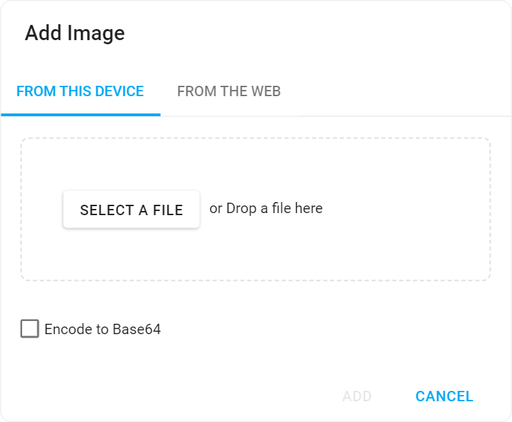
Use the fileUploadMode property to specify whether to upload images as is or in Base64 binary format. The tabs property specifies the visibility of tabs in the 'Add Image' dialog.
server or both, specify uploadDirectory to correctly upload images. If your application does not include a shared folder, check the "Encode to Base64" check box to display an uploaded image as a base64 string.jQuery
$(function() {
    $("#htmlEditorContainer").dxHtmlEditor({
        // ...
        imageUpload: {
            fileUploadMode: 'both',
            tabs: ['url', 'file'],
            uploadUrl: 'https://js.devexpress.com/Demos/Upload'
            uploadDirectory: '/Images'
        }
    });
});
Angular
<dx-html-editor ...>
    <dxo-html-editor-image-upload
        fileUploadMode="both"
        [tabs]="['url', 'file']"
        uploadUrl="https://js.devexpress.com/Demos/Upload"
        uploadDirectory="/Images">
    </dxo-html-editor-image-upload>
</dx-html-editor>
import { Component } from '@angular/core';

@Component({
    selector: 'app-root',
    templateUrl: './app.component.html',
    styleUrls: ['./app.component.css']
})
import { BrowserModule } from '@angular/platform-browser';
import { NgModule } from '@angular/core';
import { AppComponent } from './app.component';

import { DxHtmlEditorModule } from 'devextreme-angular';
@NgModule({
    declarations: [
        AppComponent
    ],
    imports: [
        BrowserModule,
        DxHtmlEditorModule
    ],
    providers: [ ],
    bootstrap: [AppComponent]
})
export class AppModule { }
Vue
<template>
    <DxHtmlEditor ...>
        <DxImageUpload
            fileUploadMode="both"
            :tabs="dialogTabs"
            uploadUrl="https://js.devexpress.com/Demos/Upload"
            uploadDirectory="/Images"
         />
    </DxHtmlEditor>
</template>

<script>
import 'devextreme/dist/css/dx.light.css';

import DxHtmlEditor from 'devextreme-vue/html-editor';

export default {
    components: {
        DxHtmlEditor
    },
    methods: {
        // ...
    },
    data() {
        return {
            dialogTabs: ['url', 'file']
        };
    }
}
</script>
React
import React from 'react';

import 'devextreme/dist/css/dx.light.css';

import HtmlEditor from 'devextreme-react/html-editor';

const dialogTabs = ['url', 'file'];

class App extends React.Component {
    render() {
        return (
            <HtmlEditor ...>
                <ImageUpload
                    fileUploadMode="both"
                    :tabs={dialogTabs}
                    uploadUrl="https://js.devexpress.com/Demos/Upload"
                    uploadDirectory="/Images"
                />
            </HtmlEditor>
        );
    }
}
export default App;
isDirty
Specifies whether the component's current value differs from the initial value.
This property is a read-only flag. You can use it to check if the editor value changed.
jQuery
$(() => {
    const htmlEditor = $('#htmlEditor').dxHtmlEditor({
        // ...
    }).dxHtmlEditor('instance');

    $('#button').dxButton({
        // ...
        onClick () {
            if (htmlEditor.option('isDirty')) {
                DevExpress.ui.notify("Do not forget to save changes", "warning", 500);
            }
        }
    });
});
Angular
import { Component, ViewChild } from '@angular/core';
import { DxHtmlEditorComponent, DxButtonModule } from 'devextreme-angular';
import notify from 'devextreme/ui/notify';

@Component({
    selector: 'app-root',
    templateUrl: './app.component.html',
    styleUrls: ['./app.component.css']
})
export class AppComponent {
    @ViewChild('htmlEditorRef', { static: false }) htmlEditor: DxHtmlEditorComponent;

    onClick () {
        if (this.htmlEditor.instance.option('isDirty')) {
            notify("Do not forget to save changes", "warning", 500);
        }
    }
}
<dx-html-editor ...
    #htmlEditorRef
>
</dx-html-editor>
<dx-button ...
    (onClick)="onClick($event)"
>
</dx-button>
Vue
<template>
    <DxHtmlEditor ...
        :ref="htmlEditorRef"
    >
    </DxHtmlEditor>
    <DxButton ...
        @click="onClick"
    />
</template>

<script>
import 'devextreme/dist/css/dx.light.css';
import DxHtmlEditor from 'devextreme-vue/html-editor';
import DxButton from 'devextreme-vue/button';
import notify from 'devextreme/ui/notify';

export default {
    components: {
        DxHtmlEditor,
        DxButton
    },

    data() {
        return {
            htmlEditorRef
        }
    },

    methods: {
        onClick () {
            if (this.htmlEditor.option('isDirty')) {
                notify("Do not forget to save changes", "warning", 500);
            }
        }
    },

    computed: {
        htmlEditor: function() {
            return this.$refs[htmlEditorRef].instance;
        }
    }
}
</script>
React
import React, { useRef } from 'react';
import HtmlEditor from 'devextreme-react/html-editor';
import Button from 'devextreme-react/button';
import 'devextreme/dist/css/dx.light.css';

const App = () => {
    const htmlEditorRef = useRef(null);

    const onClick = () => {
        if (this.htmlEditorRef.current.instance().option('isDirty')) {
            notify("Do not forget to save changes", "warning", 500);
        }
    };

    return (
        <HtmlEditor ...
            ref={htmlEditorRef}
        >
        </HtmlEditor>
        <Button ...
            onClick={onClick}
        />
    );
};

export default App;
See Also
isValid
Specifies or indicates whether the editor's value is valid.
See Also
name
The value to be assigned to the name attribute of the underlying HTML element.
Specify this property if the UI component lies within an HTML form that will be submitted.
onContentReady
A function that is executed when the UI component is rendered and each time the component is repainted.
Information about the event.
| Name | Type | Description |
|---|---|---|
| element |
The UI component's container. It is an HTML Element or a jQuery Element when you use jQuery. |
|
| component |
The UI component's instance. |
onDisposing
A function that is executed before the UI component is disposed of.
Information about the event.
| Name | Type | Description |
|---|---|---|
| element |
The UI component's container. It is an HTML Element or a jQuery Element when you use jQuery. |
|
| component |
The UI component's instance. |
onFocusIn
A function that is executed when the UI component gets focus.
Information about the event that caused the function execution.
| Name | Type | Description |
|---|---|---|
| event | Event (jQuery or EventObject) |
The event that caused the function to execute. It is an EventObject or a jQuery.Event when you use jQuery. |
| element |
The UI component's container. It is an HTML Element or a jQuery Element when you use jQuery. |
|
| component |
The UI component's instance. |
See Also
onFocusOut
A function that is executed when the UI component loses focus.
Information about the event that caused the function execution.
| Name | Type | Description |
|---|---|---|
| event | Event (jQuery or EventObject) |
The event that caused the function to execute. It is an EventObject or a jQuery.Event when you use jQuery. |
| element |
The UI component's container. It is an HTML Element or a jQuery Element when you use jQuery. |
|
| component |
The UI component's instance. |
See Also
onInitialized
A function used in JavaScript frameworks to save the UI component instance.
Information about the event.
| Name | Type | Description |
|---|---|---|
| element |
The UI component's container. It is an HTML Element or a jQuery Element when you use jQuery. |
|
| component |
The UI component's instance. |
Angular
<dx-html-editor ...
    (onInitialized)="saveInstance($event)">
</dx-html-editor>
import { Component } from "@angular/core";
import HtmlEditor from "devextreme/ui/data_grid";
// ...
export class AppComponent {
    htmlEditorInstance: HtmlEditor;
    saveInstance (e) {
        this.htmlEditorInstance = e.component;
    }
}
Vue
<template>
    <div>
        <DxHtmlEditor ...
            @initialized="saveInstance">
        </DxHtmlEditor>
    </div>
</template>

<script>
import DxHtmlEditor from 'devextreme-vue/html-editor';

export default {
    components: {
        DxHtmlEditor
    },
    data: function() {
        return {
            htmlEditorInstance: null
        };
    },
    methods: {
        saveInstance: function(e) {
            this.htmlEditorInstance = e.component;
        }
    }
};
</script>
<template>
    <div>
        <DxHtmlEditor ...
            @initialized="saveInstance">
        </DxHtmlEditor>
    </div>
</template>

<script setup>
import DxHtmlEditor from 'devextreme-vue/html-editor';

let htmlEditorInstance = null;

const saveInstance = (e) => {
    htmlEditorInstance = e.component;
}
</script>
React
import HtmlEditor from 'devextreme-react/html-editor';

class App extends React.Component {
    constructor(props) {
        super(props);

        this.saveInstance = this.saveInstance.bind(this);
    }

    saveInstance(e) {
        this.htmlEditorInstance = e.component;
    }

    render() {
        return (
            <div>
                <HtmlEditor onInitialized={this.saveInstance} />
            </div>
        );
    }
}
See Also
onOptionChanged
A function that is executed after a UI component property is changed.
Information about the event.
| Name | Type | Description |
|---|---|---|
| value | any |
The modified property's new value. |
| previousValue | any |
The UI component's previous value. |
| name |
The modified property if it belongs to the first level. Otherwise, the first-level property it is nested into. |
|
| fullName |
The path to the modified property that includes all parent properties. |
|
| element |
The UI component's container. It is an HTML Element or a jQuery Element when you use jQuery. |
|
| component |
The UI component's instance. |
The following example shows how to subscribe to component property changes:
jQuery
$(function() {
    $("#htmlEditorContainer").dxHtmlEditor({
        // ...
        onOptionChanged: function(e) {
            if(e.name === "changedProperty") {
                // handle the property change here
            }
        }
    });
});
Angular
<dx-html-editor ...
    (onOptionChanged)="handlePropertyChange($event)">
</dx-html-editor>
import { Component } from '@angular/core';

@Component({
    selector: 'app-root',
    templateUrl: './app.component.html',
    styleUrls: ['./app.component.css']
})

export class AppComponent {
    // ...
    handlePropertyChange(e) {
        if(e.name === "changedProperty") {
            // handle the property change here
        }
    }
}
import { BrowserModule } from '@angular/platform-browser';
import { NgModule } from '@angular/core';
import { AppComponent } from './app.component';
import { DxHtmlEditorModule } from 'devextreme-angular';

@NgModule({
    declarations: [
        AppComponent
    ],
    imports: [
        BrowserModule,
        DxHtmlEditorModule
    ],
    providers: [ ],
    bootstrap: [AppComponent]
})

export class AppModule { }
Vue
<template>
    <DxHtmlEditor ...
        @option-changed="handlePropertyChange"
    />
</template>

<script>
import 'devextreme/dist/css/dx.light.css';
import DxHtmlEditor from 'devextreme-vue/html-editor';

export default {
    components: {
        DxHtmlEditor
    },
    // ...
    methods: {
        handlePropertyChange: function(e) {
            if(e.name === "changedProperty") {
                // handle the property change here
            }
        }
    }
}
</script>
React
import React from 'react';
import 'devextreme/dist/css/dx.light.css';

import HtmlEditor from 'devextreme-react/html-editor';

const handlePropertyChange = (e) => {
    if(e.name === "changedProperty") {
        // handle the property change here
    }
}

export default function App() {
    return (
        <HtmlEditor ...
            onOptionChanged={handlePropertyChange}
        />
    );
}
onValueChanged
A function that is executed after the UI component's value is changed.
Information about the event.
| Name | Type | Description |
|---|---|---|
| value |
The UI component's new value. |
|
| previousValue |
The UI component's previous value. |
|
| event | Event (jQuery or EventObject) |
The event that caused the function to execute. It is an EventObject or a jQuery.Event when you use jQuery. This field is undefined if the value is changed programmatically. |
| element |
The UI component's container. It is an HTML Element or a jQuery Element when you use jQuery. |
|
| component |
The UI component's instance. |
rtlEnabled
Switches the UI component to a right-to-left representation.
When this property is set to true, the UI component text flows from right to left, and the layout of elements is reversed. To switch the entire application/site to the right-to-left representation, assign true to the rtlEnabled field of the object passed to the DevExpress.config(config) method.
DevExpress.config({
    rtlEnabled: true
});stylingMode
Specifies how the HTML Editor's toolbar and content field are styled.
The following styles are available:
You can also use the global editorStylingMode setting to specify how the text fields of all editors in your application are styled.
tabIndex
Specifies the number of the element when the Tab key is used for navigating.
The value of this property will be passed to the tabindex attribute of the HTML element that underlies the UI component.
validationError
Information on the broken validation rule. Contains the first item from the validationErrors array.
See Also
validationErrors
An array of validation errors.
Array<any>
HtmlEditor updates this property automatically as it validates values. You can also update validationErrors manually to display custom errors and implement custom validation logic. The following code snippet demonstrates how to define items in this array:
jQuery
$('#html-editor').dxHtmlEditor({
    isValid: false,
    validationErrors: [{ message: "Custom validation error" }],
})
Angular
<dx-html-editor
    [isValid]="false"
    [validationErrors]="validationErrors"
></dx-html-editor>
import { DxHtmlEditorComponent } from 'devextreme-angular/ui/html-editor'

export class AppComponent {
    validationErrors = [
        { message: 'Custom validation error' }
    ];
}
Vue
<script setup lang="ts">
import { DxHtmlEditor } from 'devextreme-vue/html-editor';

const validationErrors = [
    { message: 'Custom validation error' }
];
</script>

<template>
    <DxHtmlEditor
        :is-valid="false"
        :validation-errors="validationErrors"
    />
</template>
React
import { HtmlEditor } from 'devextreme-react/html-editor';

const validationErrors = [
    { message: 'Custom validation error' }
];

function App(): JSX.Element {
    return (
        <HtmlEditor
            isValid={false}
            validationErrors={validationErrors}
        />
    )
}
validationMessageMode
Specifies how the message about the validation rules that are not satisfied by this editor's value is displayed.
The following property values are possible:
- auto
The tooltip with the message is displayed when the editor is in focus. - always
The tooltip with the message is not hidden when the editor loses focus.
validationMessagePosition
Specifies the position of a validation message relative to the component. The validation message describes the validation rules that this component's value does not satisfy.
The following example positions a validation message at the component's right:
jQuery
$(function() {
    $("#htmlEditorContainer").dxHtmlEditor({
        // ...
        validationMessagePosition: 'right'
    }).dxValidator({
        validationRules: [{
            type: 'required',
            message: 'Required',
        }],
    });
});
Angular
<dx-html-editor ...
    validationMessagePosition="right">
    <dx-validator>
        <dxi-validator-validation-rule
            type="required"
            message="Required"
        >
        </dxi-validator-validation-rule>
    </dx-validator>
</dx-html-editor>
Vue
<template>
    <DxHtmlEditor ...
        validation-message-position="right"
    >
        <DxValidator>
            <DxRequiredRule message="Required" />
        </DxValidator>
    </DxHtmlEditor>
</template>

<script>
    // ...
</script>
React
import React from 'react';
// ...

function App() {
    return (
        <HtmlEditor ...
            validationMessagePosition="right"
        >
            <Validator>
                <RequiredRule message="Required" />
            </Validator>
        </HtmlEditor>
    );

};
export default App;
validationStatus
Indicates or specifies the current validation status.
When you assign "invalid" to validationStatus, you can also use the validationErrors array to set an error message as shown below:
jQuery
$(function() {
    const htmlEditor = $("#htmlEditorContainer").dxHtmlEditor({
        // ...
    }).dxHtmlEditor("instance");

    function setInvalidStatus(message) {
        htmlEditor.option({
            validationStatus: "invalid",
            validationErrors: [{ message: message }]
        });
    }
});
Angular
<dx-html-editor
    [validationStatus]="validationStatus"
    [validationErrors]="validationErrors">
</dx-html-editor>
// ...
export class AppComponent {
    validationStatus: string = "valid";
    validationErrors: any;
    // ...
    setInvalidStatus(message) {
        this.validationStatus = "invalid";
        this.validationErrors = [{ message: message }];
    }
}
Vue
<template>
    <DxHtmlEditor ...
        :validation-status="validationStatus"
        :validation-errors="validationErrors"
    />
</template>

<script>
    // ...
    export default {
        // ...
        data() {
            return {
                validationStatus: "valid",
                validationErrors: []
            }
        },
        methods: {
            setInvalidStatus(message) {
                this.validationStatus = "invalid";
                this.validationErrors = [{ message: message }];
            }
        }
    }
</script>
React
import React, { useState } from 'react';
// ...

function App() {
    const [validationStatus, setValidationStatus] = useState("valid");
    const [validationErrors, setValidationErrors] = useState([]);

    const setInvalidStatus = message => {
        setValidationStatus("invalid");
        setValidationErrors([{ message: message }]);
    }

    return (
        <HtmlEditor
            validationStatus={validationStatus}
            validationErrors={validationErrors}
        />
    );

};
export default App;
value
Specifies the UI component's value.
When the HTML Editor loads its value, the component removes redundant tags:
<!-- from -->
<p><span>Hello</span><em><span>World</span></em></p>

<!-- to -->
<p>Hello<em>World</em></p>
The component merges consecutive inline tags that match and contain identical attributes:
<!-- from -->
<a href="/">Hello</a><a href="/">World</a>

<!-- to -->
<a href="/">HelloWorld</a>
To avoid this behavior, specify other elements between identical inline tags.
variables
Configures variables that are placeholders for values created once text is processed.
A user can insert variables in the text and remove them, but never modify them.
jQuery
$(function(){
    $("#htmlEditorContainer").dxHtmlEditor({
        toolbar: {
            // Adds a toolbar item that allows users to insert variables
            items: [ "variable" ]
        },
        variables: {
            dataSource: [ "FirstName", "LastName", "Company" ],
            escapeChar: [ "{", "}" ]
        }
    })
})
Angular
<dx-html-editor>
    <!-- Adds a toolbar item that allows users to insert variables -->
    <dxo-html-editor-toolbar>
        <dxi-html-editor-item name="variable"></dxi-html-editor-item>
    </dxo-html-editor-toolbar>
    <dxo-html-editor-variables
        [dataSource]="[ 'FirstName', 'LastName', 'Company' ]"
        [escapeChar]="[ '{', '}' ]">
    </dxo-html-editor-variables>
</dx-html-editor>
import { DxHtmlEditorModule } from "devextreme-angular";
// ...
export class AppComponent {
    // ...
}
@NgModule({
    imports: [
        // ...
        DxHtmlEditorModule
    ],
    // ...
})
Vue
<template>
    <DxHtmlEditor ... >
        <!-- Adds a toolbar item that allows users to insert variables -->
        <DxToolbar>
            <DxItem name="variable" />
        </DxToolbar>
        <DxVariables
            :data-source="variables"
            :escape-char="escapeCharacters"
        />
    </DxHtmlEditor>
</template>

<script>
import 'devextreme/dist/css/dx.light.css';

import DxHtmlEditor, {
    DxToolbar,
    DxItem,
    DxVariables
} from 'devextreme-vue/html-editor';

export default {
    components: {
        DxHtmlEditor,
        DxVariables
    },
    data() {
        return {
            variables: ['FirstName', 'LastName', 'Company'],
            escapeCharacters: ['{', '}']
        };
    }
}
</script>
React
import 'devextreme/dist/css/dx.light.css';

import HtmlEditor, {
    Variables
} from 'devextreme-react/html-editor';

const variables = ['FirstName', 'LastName', 'Company'];
const escapeCharacters = ['{', '}'];

export default function App() {
    return (
        <HtmlEditor>
            {/* Adds a toolbar item that allows users to insert variables */}
            <Toolbar>
                <Item name="variable" />
            </Toolbar>
            <Variables
                dataSource={variables}
                escapeChar={escapeCharacters}
            />
        </HtmlEditor>
    );
}
To learn how to implement mail merge with variables, refer to this example:

 Select one or more answers