Angular CardView - Card Elements
CardView displays data in customizable cards. This help topic highlights the elements of CardView cards.
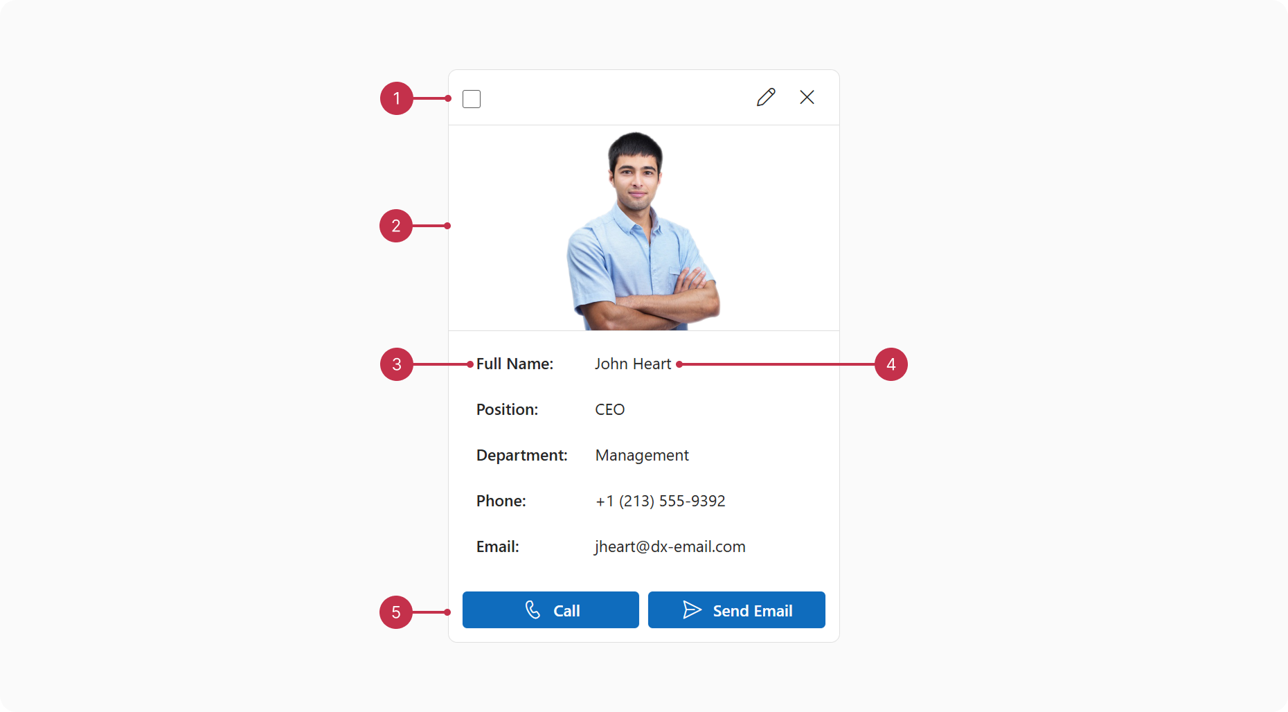
You can customize the following card elements:
- Header
CardView cards feature a header that displays multiple controls, such as selection checkboxes and editing command buttons. You can add custom controls in the cardHeader.items[] array. - Cover
Configure the cardCover property to display images in cards. - Fields
Customize how cards display data with columns[] properties such as caption, customizeText, and fieldTemplate. - Footer
Add a custom card footer with the cardFooterTemplate property.

 Select one or more answers