Angular Stepper - Overview
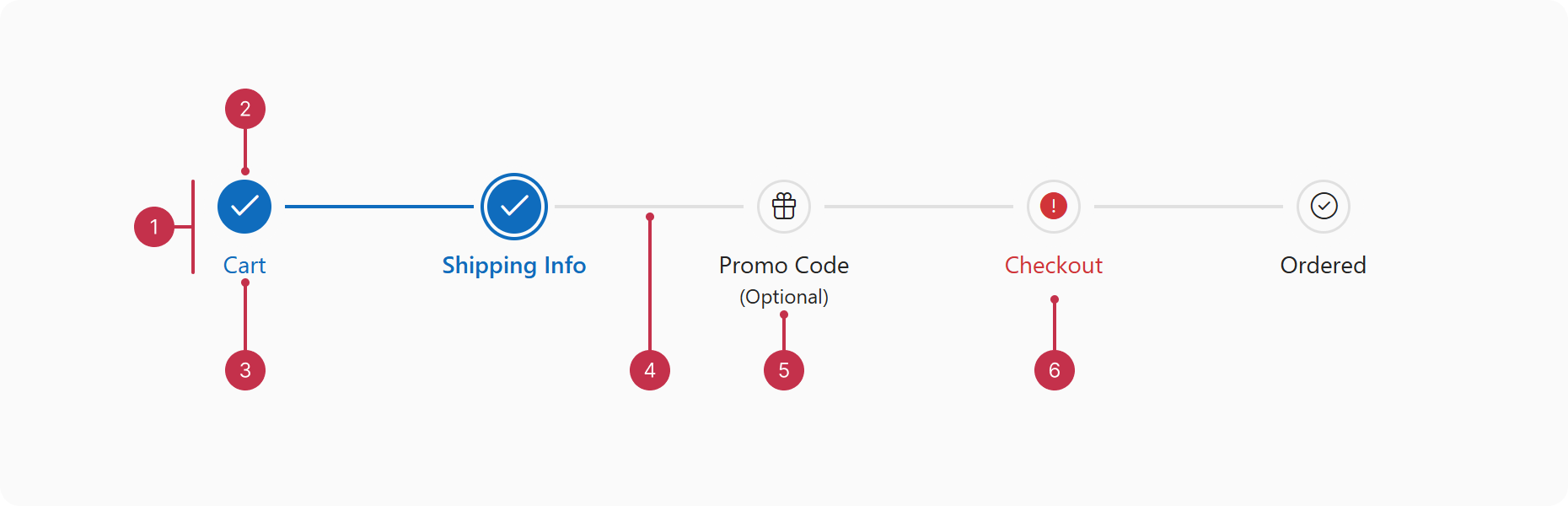
DevExtreme Stepper is an interactive UI component for implementing multi-step forms and processes in your project, like sign-up forms, checkouts, set-up wizards, and more.
This overview highlights Stepper elements and key features.
Key Features
- Orientation Options
Stepper supports horizontal and vertical orientation options. - Navigation Modes
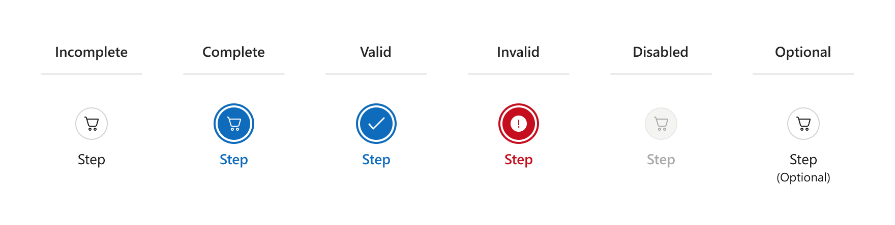
The linear property enables sequential navigation. Disable linear to allow users to skip steps. - Step Types and States
The component offers various step types and states such as optional and disabled. You can also indicate step validity with the isValid property.
- Step Customization
Stepper offers multiple step customization options like configurable step labels and hints. You can also set custom step icons or text. Advanced Customization with Templates
Implement in-depth customizations such as custom step shapes with item templates. To do so, define itemTemplate or items[].template.Selection Options
You can get and set the selected step with selectedItem and selectedIndex. Implement custom logic upon selection change with onSelectionChanged and onSelectionChanging.- Keyboard Navigation
Stepper supports keyboard navigation. The component automatically selects steps focused with the keyboard if selectOnFocus is enabled. - Right-to-Left Mode
Switch between left-to-right and right-to-left progression on horizontal Steppers with the rtlEnabled property. rtlEnabled changes the placement of step labels on vertical Steppers.

 Select one or more answers