Angular TabPanel - Getting Started
jQuery
Angular
Vue
React
The TabPanel UI component consists of the Tabs and MultiView components. The TabPanel automatically synchronizes the selected tab with the currently displayed view and vice versa.
This tutorial explains how to add a TabPanel to a page and configure its core features. The following control demonstrates the result:
Refer to the sections below for more information about each configuration step. The full code is available in the GitHub repository.
Create the TabPanel
jQuery
Add DevExtreme to your jQuery application and use the following code to create a TabPanel:
$(function() {
    $("#tabPanel").dxTabPanel({
        // Configuration goes here
    });
});
<html>
    <head>
        <!-- ... -->
        <script type="text/javascript" src="https://code.jquery.com/jquery-3.5.1.min.js"></script>

        <link rel="stylesheet" href="https://cdn3.devexpress.com/jslib/25.2.5/css/dx.light.css">
        <link rel="stylesheet" href="index.css">

        <script type="text/javascript" src="https://cdn3.devexpress.com/jslib/25.2.5/js/dx.all.js"></script>
        <script type="text/javascript" src="index.js"></script>
    </head>
    <body class="dx-viewport">
        <div id="tabPanel"></div>
    </body>
</html>
#tabPanel {
    height: 250px;
    width: 500px;
}
Angular
Add DevExtreme to your Angular application and use the following code to create a TabPanel:
<dx-tab-panel id="tabPanel">
    <!-- Configuration goes here -->
</dx-tab-panel>
import { Component } from '@angular/core';

@Component({
    selector: 'app-root',
    templateUrl: './app.component.html',
    styleUrls: ['./app.component.css']
})
export class AppComponent {

}
import { BrowserModule } from '@angular/platform-browser';
import { NgModule } from '@angular/core';
import { AppComponent } from './app.component';

import { DxTabPanelModule } from 'devextreme-angular';

@NgModule({
    declarations: [
        AppComponent
    ],
    imports: [
        BrowserModule,
        DxTabPanelModule
    ],
    providers: [ ],
    bootstrap: [AppComponent]
})
export class AppModule { }
#tabPanel {
    height: 250px;
    width: 500px;
}
Vue
Add DevExtreme to your Vue application and use the following code to create a TabPanel:
<template>
    <DxTabPanel id="tabPanel">
        <!-- Configuration goes here -->
    </DxTabPanel>
</template>

<script>
import 'devextreme/dist/css/dx.light.css';

import { DxTabPanel } from 'devextreme-vue/tab-panel';

export default {
    components: {
        DxTabPanel
    }
}
</script>

<style>
#tabPanel {
    height: 250px;
    width: 500px;
}
</style>
React
Add DevExtreme to your React application and use the following code to create a TabPanel:
import React from 'react';
import 'devextreme/dist/css/dx.light.css';

import TabPanel from 'devextreme-react/tab-panel';

const App = () => {
    return (
        <TabPanel id="tabPanel">
            {/* Configuration goes here */}
        </TabPanel>
    );
}

export default App;
#tabPanel {
    height: 250px;
    width: 500px;
}
Create Tabs
Populate the items array with data items. The TabPanel generates a tab with a view for each item in this array.
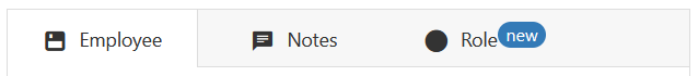
Specify a tab's title and/or icon properties to configure an individual tab. The code below uses icons from the DevExtreme icon library. You can also use the badge property to create a badge with custom text.
jQuery
$(function(){
    $("#tabPanel").dxTabPanel({
        items: [{
            title: "Employee",
            icon: "floppy",
            // ...
        }, {
            title: "Notes",
            icon: "comment",
            // ...
        }, {
            title: "Role",
            icon: "isnotblank",
            badge: "new",
            // ...
        }]
    });
});
Angular
<dx-tab-panel>
    <dxi-tab-panel-item title="Employee" icon="floppy">
        <!-- ... -->
    </dxi-tab-panel-item>
    <dxi-tab-panel-item title="Notes" icon="comment">
        <!-- ... -->
    </dxi-tab-panel-item>
    <dxi-tab-panel-item title="Role" icon="isnotblank" badge="new">
        <!-- ... -->
    </dxi-tab-panel-item>
</dx-tab-panel>
Vue
<template>
    <DxTabPanel>
        <DxItem title="Employee" icon="floppy">
            <!-- ... -->
        </DxItem>
        <DxItem title="Notes" icon="comment">
            <!-- ... -->
        </DxItem>
        <DxItem title="Role" icon="isnotblank" badge="new">
            <!-- ... -->
        </DxItem>
    </DxTabPanel>
</template>

<script>
import 'devextreme/dist/css/dx.light.css';

import DxTabPanel, { DxItem } from "devextreme-vue/tab-panel";

export default {
    components: {
        DxTabPanel,
        DxItem
    }
}
</script>
React
import React from 'react';
import 'devextreme/dist/css/dx.light.css';

import TabPanel, { Item } from "devextreme-react/tab-panel";

const App = () => {
    return (
        <TabPanel>
            <Item title="Employee" icon="floppy">
                {/* ... */}
            </Item>
            <Item title="Notes" icon="comment">
                {/* ... */}
            </Item>
            <Item title="Role" icon="isnotblank" badge="new">
                {/* ... */}
            </Item>
        </TabPanel>
    );
}

export default App;
The code above produces the following output:
You can also use the itemTitleTemplate property to specify a custom template for all tabs. items.tabTemplate overrides the itemTitleTemplate property and allows you to specify a template for an individual tab. This approach is not shown in this tutorial, but you can refer to the property descriptions for details.
Specify View Content
You can use the following properties to specify view content:
itemTemplate
Specifies a custom template for all views.items[].template
Specifies a custom template for an individual view. This property overrides itemTemplate.items[].text
Specifies text displayed in an individual view.noDataText
Specifies text or markup to display when views do not have content.
This tutorial demonstrates the use of the items[].template property. This property allows you to specify different content for individual views. In the code below, the views contain the Form, TextArea, and RadioGroup UI components.
jQuery
$(function(){
    $("#tabPanel").dxTabPanel({
        items: [
            {
                title: "Employee",
                icon: "floppy",
                template: function () {
                    return $("<div id='form'>").dxForm({
                        formData: employeeData,
                        items: [
                            {
                                dataField: "name",
                                label: {
                                    template: labelTemplate("user"),
                                },
                            },
                            {
                                dataField: "position",
                                label: {
                                    template: labelTemplate("group"),
                                },
                            },
                            "hireDate",
                            {
                                dataField: "officeNumber",
                                label: {
                                    template: labelTemplate("info"),
                                },
                            },
                        ],
                    });
                },
            },
            {
                title: "Notes",
                icon: "comment",
                template: function () {
                    return $("<div id='textArea'>").dxTextArea({
                        value: employeeData.notes,
                    });
                },
            },
            {
                title: "Role",
                icon: "isnotblank",
                badge: "new",
                template: function () {
                    return $("<div id='radioGroup'>").dxRadioGroup({
                        items: employeeData.roles,
                        value: employeeData.roles[0],
                    });
                },
            },
        ]
    });

    const employeeData = {
        name: "John Heart",
        position: "CEO",
        hireDate: new Date(2012, 4, 13),
        officeNumber: 901,
        notes: "John has been in the Audio/Video industry since 1990. He has led DevAV as its CEO since 2003.",
        roles: ["Chief Officer", "Manager", "Administrator"]
    };
});
Angular
<dx-tab-panel>
    <dxi-tab-panel-item title="Employee" icon="floppy">
        <div *dxTemplate>
            <dx-form
                id="form"
                [formData]="employeeData"
            >
                <dxi-form-item dataField="name">
                    <dxo-form-label template="name"></dxo-form-label>
                </dxi-form-item>
                <dxi-form-item dataField="position">
                    <dxo-form-label template="position"></dxo-form-label>
                </dxi-form-item>
                <<dxi-form-item dataField="hireDate"></dxi-form-item>
                <dxi-form-item dataField="officeNumber">
                    <dxo-form-label template="officeNumber"></dxo-form-label>
                </dxi-form-item>
                <ng-container *ngFor="let label of labelTemplates">
                    <div *dxTemplate="let data of label.name">
                        <div><i class="dx-icon {{ label.icon }}"></i>{{ data.text }}</div>
                    </div>
                </ng-container>
            </dx-form>
        </div>
    </dxi-tab-panel-item>
    <dxi-tab-panel-item title="Notes" icon="comment">
        <div *dxTemplate>
            <dx-text-area
                [(value)]="employeeData.notes">
            </dx-text-area>
        </div>
    </dxi-tab-panel-item>
    <dxi-tab-panel-item title="Role" icon="isnotblank" badge="new">
        <div *dxTemplate>
            <dx-radio-group
                [items]="employeeData.roles"
                [(value)]="employeeData.roles[0]">
            </dx-radio-group>
        </div>
    </dxi-tab-panel-item>
</dx-tab-panel>
import { Component } from '@angular/core';

@Component({
    selector: 'app-root',
    templateUrl: './app.component.html',
    styleUrls: ['./app.component.css']
})
export class AppComponent {
    employeeData = {
        name: 'John Heart',
        position: 'CEO',
        hireDate: new Date(2012, 4, 13),
        officeNumber: 901,
        notes: 'John has been in the Audio/Video industry since 1990. He has led DevAV as its CEO since 2003.',
        roles: ['Chief Officer', 'Administrator', 'Manager']
    }
    labelTemplates = [
        {name: 'name', icon: 'dx-icon-info'},
        {name: 'position', icon: 'dx-icon-group'},
        {name: 'officeNumber', icon: 'dx-icon-info'}
    ]
}
import { BrowserModule } from '@angular/platform-browser';
import { NgModule } from '@angular/core';
import { AppComponent } from './app.component';

import {
    DxTabPanelModule,
    DxFormModule,
    DxTextAreaModule,
    DxRadioGroupModule
} from 'devextreme-angular';

@NgModule({
    declarations: [
        AppComponent
    ],
    imports: [
        BrowserModule,
        DxTabPanelModule,
        DxFormModule,
        DxTextAreaModule,
        DxRadioGroupModule
    ],
    providers: [ ],
    bootstrap: [AppComponent]
})
export class AppModule { }
Vue
<template>
    <DxTabPanel>
        <DxItem title="Employee" icon="floppy">
            <template #default>
                <DxForm
                    id="form"
                    :form-data="employeeData"
                >
                    <DxSimpleItem data-field="name">
                        <DxLabel template="nameLabel"/>
                    </DxSimpleItem>
                    <DxSimpleItem data-field="position">
                        <DxLabel template="positionLabel"/>
                    </DxSimpleItem>
                    <DxSimpleItem data-field="hireDate" />
                    <DxSimpleItem data-field="officeNumber">
                        <DxLabel template="officeNumberLabel"/>
                    </DxSimpleItem>
                    <template #nameLabel="{ data }">
                        <i class="dx-icon dx-icon-user"/>{{ data.text }}
                    </template>
                    <template #positionLabel="{ data }">
                        <i class="dx-icon dx-icon-group"/>{{ data.text }}
                    </template>
                    <template #officeNumberLabel="{ data }">
                        <i class="dx-icon dx-icon-info"/>{{ data.text }}
                    </template>
                </DxForm>
            </template>
        </DxItem>
        <DxItem title="Notes" icon="comment">
            <template #default>
                <DxTextArea
                    v-model:value="employeeData.notes"
                />
            </template>
        </DxItem>
        <DxItem title="Role" icon="isnotblank" badge="new">
            <template #default>
                <DxRadioGroup
                    :items="employeeData.roles"
                    v-model:value="employeeData.roles[0]"
                />
            </template>
        </DxItem>
    </DxTabPanel>
</template>

<script>
import 'devextreme/dist/css/dx.light.css';

import DxTabPanel, { DxItem } from "devextreme-vue/tab-panel";
import DxForm, { DxSimpleItem, DxLabel } from "devextreme-vue/form";
import DxTextArea from "devextreme-vue/text-area";
import DxRadioGroup from "devextreme-vue/radio-group";

export default {
    components: {
        DxTabPanel,
        DxItem,
        DxForm,
        DxSimpleItem,
        DxLabel,
        DxTextArea,
        DxRadioGroup
    },
    data() {
        const employeeData = {
            name: 'John Heart',
            position: 'CEO',
            hireDate: new Date(2012, 4, 13),
            officeNumber: 901,
            notes: 'John has been in the Audio/Video industry since 1990. He has led DevAV as its CEO since 2003.',
            roles: ['Chief Officer', 'Administartor', 'Manager']
        };
        return {
            employeeData
        };
    },
}
</script>
React
import React from 'react';
import 'devextreme/dist/css/dx.light.css';

import TabPanel, { Item } from "devextreme-react/tab-panel";
import Form, { SimpleItem, Label } from "devextreme-react/form";
import TextArea from "devextreme-react/text-area";
import RadioGroup from "devextreme-react/radio-group";

const employeeData = {
    name: 'John Heart',
    position: 'CEO',
    hireDate: new Date(2012, 4, 13),
    officeNumber: 901,
    notes: 'John has been in the Audio/Video industry since 1990. He has led DevAV as its CEO since 2003.',
    roles: ['Chief Officer', 'Administrator', 'Manager']
};

const labelTemplate = (iconName) => {
    return function template(data) {
        return (<div><i className={`dx-icon dx-icon-${iconName}`}></i>{ data.text }</div>);
    };
}

const App = () => {
    return (
        <TabPanel>
            <Item title="Employee" icon="floppy">
                <Form
                    id="form"
                    formData={employeeData}
                >
                    <SimpleItem dataField="name">
                        <Label render={labelTemplate('user')} />
                    </SimpleItem>
                    <SimpleItem dataField="position">
                        <Label render={labelTemplate('group')} />
                    </SimpleItem>
                    <SimpleItem dataField="hireDate" />
                    <SimpleItem dataField="officeNumber">
                        <Label render={labelTemplate('info')} />
                    </SimpleItem>
                </Form>
            </Item>
            <Item title="Notes" icon="comment">
                <TextArea
                    defaultValue={employeeData.notes}
                />
            </Item>
            <Item title="Role" icon="isnotblank" badge="new">
                <RadioGroup
                    items={employeeData.roles}
                    defaultValue={employeeData.roles[0]}
                />
            </Item>
        </TabPanel>
    );
}

export default App;
To learn how to display DevExtreme components in a TabPanel's view content area, refer to the following example:
Navigate Between Tabs
Specify the following properties to configure navigation between tabs:
swipeEnabled
Specifies whether users can switch between views with the swipe gesture.loop
Specifies whether to loop views.animationEnabled
Specifies whether to animate the change of the current view.selectedIndex
Specifies the index of the currently selected tab. Use this property to switch between tabs programmatically. In this tutorial, this property's value depends on the the RadioGroup's selected item (seetabSwitcherRadioGroup).
jQuery
$(function(){
    let tabPanel = $("#tabPanel").dxTabPanel({
        loop: true,
        animationEnabled: true,
        swipeEnabled: true,
        selectedIndex: 0,
        onSelectionChanged: function(e) {
            const selectedTab = e.addedItems[0].title;
            tabSwitcherRadioGroup.option("value", selectedTab);
        },
        // ...
    }).dxTabPanel("instance");

    let tabSwitcherRadioGroup = $("#radioGroup").dxRadioGroup({
        items: tabNames,
        value: tabNames[0],
        layout: "horizontal",
        onValueChanged: function(e) {
            const selectedTabIndex = tabNames.indexOf(e.value);
            tabPanel.option("selectedIndex", selectedTabIndex);
        }
    }).dxRadioGroup("instance");
});

const tabNames = ["Employee", "Notes", "Role"];
Angular
<dx-tab-panel
    [loop]="true"
    [animationEnabled]="true"
    [swipeEnabled]="true"
    [(selectedIndex)]="selectedTabIndex">
    <!-- ... -->
</dx-tab-panel>

<dx-radio-group
    [items]="tabNames"
    [value]="tabNames[selectedTabIndex]"
    layout="horizontal"
    (onValueChanged)="onValueChanged($event)">
</dx-radio-group>
import { Component } from '@angular/core';

@Component({
    selector: 'app-root',
    templateUrl: './app.component.html',
    styleUrls: ['./app.component.css']
})
export class AppComponent {
    // ...

    tabNames = ["Employee", "Notes", "Role"]

    selectedTabIndex = 0;

    onValueChanged(e){
        this.selectedTabIndex = this.tabNames.indexOf(e.value);
    }
}
Vue
<template>
    <div>
        <DxTabPanel
            :loop="true"
            :animation-enabled="true"
            :swipe-enabled="true"
            v-model:selected-index="selectedTabIndex">
            <!-- ... -->
        </DxTabPanel>

        <DxRadioGroup
            :items="tabNames"
            :value="tabNames[selectedTabIndex]"
            layout="horizontal"
            @value-changed="onValueChanged"
        />
    </div>
</template>

<script>
    // ...
export default {
    data() {
        // ...
        const tabNames = ['Employee', 'Notes', 'Role'];

        return {
            selectedTabIndex: 0,
            tabNames
        };
    },
    methods: {
        onValueChanged(e){
            this.selectedTabIndex = this.tabNames.indexOf(e.value);
        }
    }
}
</script>
React
import React, { useState, useCallback } from 'react';
// ...

const tabNames = ['Employee', 'Notes', 'Role'];

const App = () => {
    const [selectedTabIndex, setSelectedTabIndex] = useState(0);

    const onRadioGroupValueChanged = useCallback((e) => {
        setSelectedTabIndex(tabNames.indexOf(e.value));
    }, []);

    const onTabSelectionChanged = useCallback((e) => {
        setSelectedTabIndex(tabNames.indexOf(e.addedItems[0].title));
    }, []);
    return (
        <div>
            <TabPanel
                loop={true}
                animationEnabled={true}
                swipeEnabled={true}
                selectedIndex={selectedTabIndex}
                onSelectionChanged={onTabSelectionChanged}>
                {/* ... */}
            </TabPanel>

            <RadioGroup
                items={tabNames}
                value={tabNames[selectedTabIndex]}
                layout="horizontal"
                onValueChanged={onRadioGroupValueChanged}
            />
        </div>
    );
}

export default App;
For further information on the TabPanel UI component, refer to the following resources:

 Select one or more answers