jQuery Chart - BarSeries
All the settings in this section are specified as follows:
The commonSeriesSettings object
Specifies settings for all series in a Chart.The commonSeriesSettings.bar object
Specifies settings for all series of the bar type.An object in the series array
Specifies settings for an individual series.
aggregation
If the Chart contains many series points, displaying all of them may lower its performance. In this case, it is better to aggregate the series points, or replace a group of them with a single point. The group includes only those points that fall within the same interval on the argument axis. See aggregationInterval and aggregationGroupWidth for details on dividing the axis into intervals.
The Chart provides several aggregation methods, which differ depending on the series type, and a capability to implement a custom aggregate function. To enable data aggregation for the series, set the aggregation.enabled option to true.
See Also
- Points Aggregation Demo: Multi-Series Chart | Financial Chart
- Data Aggregation
- autoHidePointMarkers
argumentField
In the Cartesian coordinate system, each point is characterized by a pair of coordinates (X, Y). In the Chart widget, X's are provided by the argumentField; Y's are provided by the valueField.
Commonly, a chart contains several series, and many of them have the same argument field. In this case, assign the name of this field to the argumentField property of the commonSeriesSettings object. If a series must have a unique argument field, specify the same property, but do so in the series object within the series array.
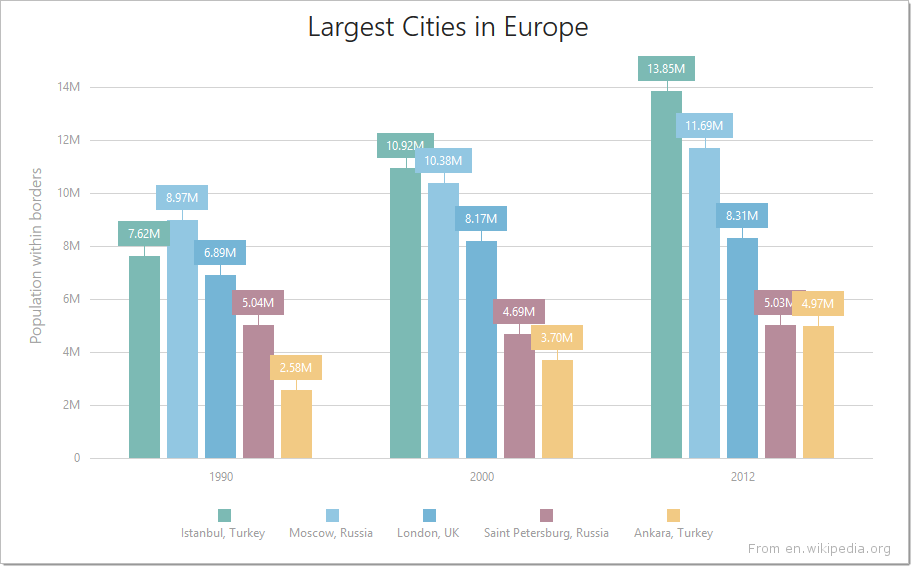
barOverlapGroup
Set this option to identical values for the series you want to collect in a single group.
The following image shows a regular bar chart with two series...

...and here the same series are collected in a barOverlapGroup:

barPadding
Controls the padding and consequently the width of all bars in a series using relative units. Ignored if the barWidth option is set.
This option accepts a value from 0 to 1 that specifies the correlation between the empty space on a bar's sides and the bar's width: 0 - the bar occupies the whole allocated space; 1 - virtually hides the bar creating a lot of empty space.
See Also
barWidth
Specifies a fixed width for all bars in a series, measured in pixels. Takes precedence over the barPadding option.
A bar's maximum width is limited. In single-series charts, it cannot be greater than the interval between two major ticks. In multi-series charts, it depends on the number of bars in the parent group and this group's actual width. See the Specify the Bar Width article for more information.
See Also
- barGroupWidth
- series.minBarSize
border
Configures the series border (in area-like series) or the series point border (in bar-like and bubble series).
Declared in commonSeriesSettings, the border settings apply to all series in the chart. Declared in a series configuration object, the border settings apply to this particular series only. The series-specific border settings override the common ones.
color
This option supports the following colors:
- Hexadecimal colors
- RGB colors
- RGBA colors
- Predefined/cross-browser color names
- Predefined SVG colors
Specified in the commonSeriesSettings object, this option colors all series in the chart. To color an individual series, specify this option in the series object within the series array.
hoverMode
When a user points to a series, it may react in one of the following ways depending on the value of the hoverMode option.
| hoverMode | Result |
|---|---|
| "onlyPoint" |  |
| "allSeriesPoints" | 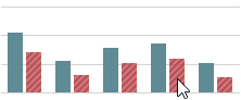 |
| "allArgumentPoints" | 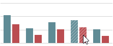 |
| "none" |  |
Use the ChartSeriesHoverMode enum to specify this option when the widget is used as an ASP.NET MVC 5 Control or a DevExtreme-Based ASP.NET Core Control. This enum accepts the following values: OnlyPoint, AllSeriesPoints, AllArgumentPoints, and None. Note that although this enum accepts more values, only the listed ones can be applied to a bar series.
See Also
- hoverStyle - specifies the appearance of series in the hover state.
hoverStyle
Declared in commonSeriesSettings, hoverStyle applies to all series in the chart. Declared in a series configuration object, hoverStyle applies to this particular series only. The series-specific hoverStyle overrides the common one.
label
Declared in commonSeriesSettings, the label settings apply to all point labels in the chart. Declared in a series configuration object, the label settings apply only to the point labels that belong to this particular series. The series-specific label settings override the common ones.
jQuery
$(function() {
    $("#chartContainer").dxChart({
        // ...
        series: [{
            label: {
                // Settings for all point labels of an individual series
            }
        }, {
            // ...
        }],
        commonSeriesSettings: {
            label: {
                // Settings for all point labels in the Chart
            }
        }
    });
});
Angular
<dx-chart ... >
    <dxi-series>
        <dxo-label ... >
            <!-- Settings for all point labels of an individual series -->
        </dxo-label>
    </dxi-series>
    <dxo-common-series-settings ... >
        <dxo-label ... >
            <!-- Settings for all point labels in the Chart -->
        </dxo-label>
    </dxo-common-series-settings>
</dx-chart>
import { Component } from '@angular/core';

@Component({
    selector: 'app-root',
    templateUrl: './app.component.html',
    styleUrls: ['./app.component.css']
})
export class AppComponent {
    // ...
}
import { BrowserModule } from '@angular/platform-browser';
import { NgModule } from '@angular/core';
import { AppComponent } from './app.component';

import { DxChartModule } from 'devextreme-angular';

@NgModule({
    declarations: [
        AppComponent
    ],
    imports: [
        BrowserModule,
        DxChartModule
    ],
    providers: [ ],
    bootstrap: [AppComponent]
})
export class AppModule { }
Vue
<template>
    <DxChart ... >
        <DxSeries ... >
            <DxLabel ...>
                <!-- Settings for all point labels of an individual series -->
            </DxLabel>
        </DxSeries>
        <DxCommonSeriesSettings ... >
            <DxLabel ... >
                <!-- Settings for all point labels in the Chart -->
            </DxLabel>
        </DxCommonSeriesSettings>
    </DxChart>
</template>

<script>
import DxChart, {
    DxSeries,
    DxLabel,
    DxCommonSeriesSettings
} from 'devextreme-vue/chart';

export default {
    components: {
        DxChart,
        DxSeries,
        DxLabel,
        DxCommonSeriesSettings
    },
    // ...
}
</script>
React
import React from 'react';

import Chart, {
    Series,
    Label,
    CommonSeriesSettings
} from 'devextreme-react/chart';

class App extends React.Component {
    render() {
        return (
            <Chart ... >
                <Series ... >
                    <Label ... >
                        // Settings for all point labels of an individual series
                    </Label>
                </Series>
                <CommonSeriesSettings ... >
                    <Label ... >
                        // Settings for all point labels in the Chart
                    </Label>
                </CommonSeriesSettings>
            </Chart>
        );
    }
}
export default App;See Also
maxLabelCount
If the number of points in a series increases over time, there comes a time when it becomes so massive that displaying labels for them makes the chart too cluttered. In this instance, to keep the chart clear to the viewer, specify a limit for the number of point labels using the maxLabelCount option. Once this limit is exceeded, all point labels of the series will be hidden.
minBarSize
Specifies the minimal possible height (or length if the chart is rotated) of a bar in pixels. Applies only to bar-like series.
If the disparity between the smallest and largest values in the data source is considerable, small values are visualized by tiny bars that may be difficult to interact with. In this case, specify the minimal possible height (or length if the chart is rotated) for bars using the minBarSize option.
See Also
pane
If this option is not specified, the series will belong to the default pane.
See Also
- panes - declares a collection of panes.
selectionMode
When a user selects a bar, its series may react in one of the following ways depending on the value of the selectionMode option.
| selectionMode | Result |
|---|---|
| "onlyPoint" | |
| "allSeriesPoints" | |
| "allArgumentPoints" | |
| "none" | |
Use the ChartSeriesSelectionrMode enum to specify this option when the widget is used as an ASP.NET MVC 5 Control or a DevExtreme-Based ASP.NET Core Control. This enum accepts the following values: OnlyPoint, AllSeriesPoints, AllArgumentPoints, and None. Note that although this enum accepts more values, only the listed ones can be applied to a bar series.
See Also
- pointSelectionMode - specifies whether only one or several bars can stay selected.
- series.selectionStyle - specifies the appearance of bars in the selected state.
- pointSelectionChanged - an event that fires after the selection state of a bar has been changed.
selectionStyle
Declared in commonSeriesSettings, selectionStyle applies to all series in the chart. Declared in a series configuration object, selectionStyle applies to this particular series only. The series-specific selectionStyle overrides the common one.
tagField
This option allows you to associate virtually any required data with a series point. This data will be stored in the tag field of the Point object.
Commonly, a chart contains several series, and many of them have the same tagField value. In this case, specify the tagField property in the commonSeriesSettings object. If a series must have a unique tagField value, specify the same property, but do so in the series object within the series array.
See Also
- series.tag - associates data with an entire series.
valueErrorBar
Error bars are used on charts to indicate an error or an uncertainty in a reported measurement. They give a general idea of how precise the measurement is.

Error bars can be generated either from concrete or calculated values. To generate one error bar, two values, high and low, are needed. If the data source of your chart provides concrete high and low values, assign the required data source fields to the highValueField and lowValueField options.
Alternatively, error bar values can be calculated according to an algorithm. In this case, choose the required algorithm using the type option, and specify the value to be used in calculation using the value option.
valueField
In the Cartesian coordinate system, each point is characterized by a pair of coordinates (X, Y). In a common case, X's are provided by the argumentField; Y's are provided by the valueField.
Certain series types require more than one value field, because their points are characterized by a larger number of coordinates. These series types are:
- Range-like series types
Range bar and range area require two value fields: rangeValue1Field and rangeValue2Field. - Financial series types
Stock and candlestick require four value fields: openValueField, closeValueField, highValueField and lowValueField.
If you use a series template, specify the value field properties in the commonSeriesSettings object. Otherwise, do this in the series object within the series array.