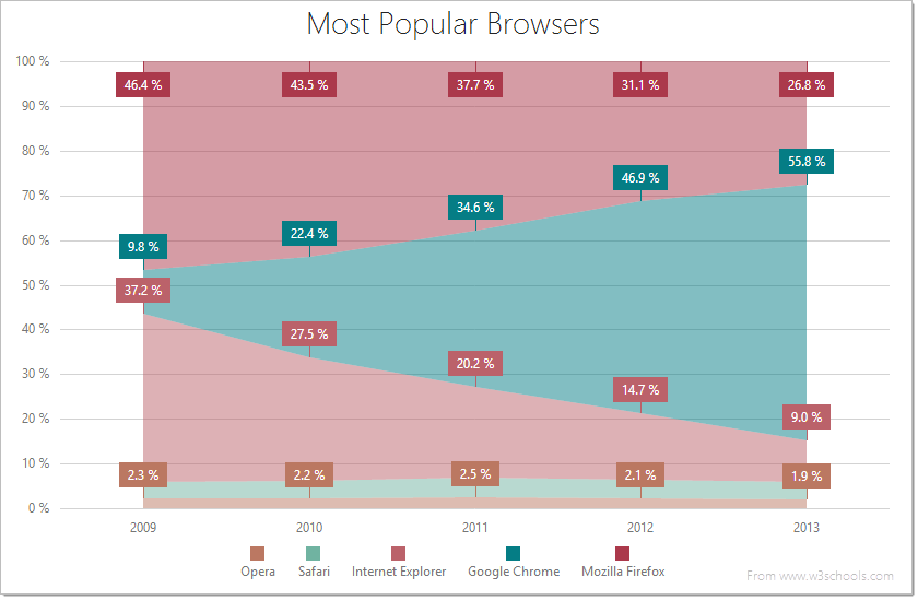
jQuery Chart - FullStackedAreaSeries
All the settings in this section are specified as follows:
The commonSeriesSettings object
Specifies settings for all series in a Chart.The commonSeriesSettings.fullstackedarea object
Specifies settings for all series of the fullstackedarea type.An object in the series array
Specifies settings for an individual series.
aggregation
If the Chart contains many series points, displaying all of them may lower its performance. In this case, it is better to aggregate the series points, or replace a group of them with a single point. The group includes only those points that fall within the same interval on the argument axis. See aggregationInterval and aggregationGroupWidth for details on dividing the axis into intervals.
The Chart provides several aggregation methods, which differ depending on the series type, and a capability to implement a custom aggregate function. To enable data aggregation for the series, set the aggregation.enabled option to true.
See Also
- Points Aggregation Demo: Multi-Series Chart | Financial Chart
- Data Aggregation
- autoHidePointMarkers
argumentField
In the Cartesian coordinate system, each point is characterized by a pair of coordinates (X, Y). In the Chart widget, X's are provided by the argumentField; Y's are provided by the valueField.
Commonly, a chart contains several series, and many of them have the same argument field. In this case, assign the name of this field to the argumentField property of the commonSeriesSettings object. If a series must have a unique argument field, specify the same property, but do so in the series object within the series array.
border
Configures the series border (in area-like series) or the series point border (in bar-like and bubble series).
Declared in commonSeriesSettings, the border settings apply to all series in the chart. Declared in a series configuration object, the border settings apply to this particular series only. The series-specific border settings override the common ones.
color
This option supports the following colors:
- Hexadecimal colors
- RGB colors
- RGBA colors
- Predefined/cross-browser color names
- Predefined SVG colors
Specified in the commonSeriesSettings object, this option colors all series in the chart. To color an individual series, specify this option in the series object within the series array.
hoverMode
When a user points to a series, it may react in one of the following ways depending on the value of the hoverMode option.
| hoverMode | Result |
|---|---|
| "nearestPoint" |  |
| "includePoints" |  |
| "excludePoints" |  |
| "none" |  |
Use the ChartSeriesHoverMode enum to specify this option when the widget is used as an ASP.NET MVC 5 Control or a DevExtreme-Based ASP.NET Core Control. This enum accepts the following values: NearestPoint, IncludePoints, ExcludePoints, and None. Note that although this enum accepts more values, only the listed ones can be applied to a full-stacked area series.
See Also
- hoverStyle - specifies the appearance of series in the hover state.
- point.hoverMode - specifies the hover mode of series points.
hoverStyle
Declared in commonSeriesSettings, hoverStyle applies to all series in the chart. Declared in a series configuration object, hoverStyle applies to this particular series only. The series-specific hoverStyle overrides the common one.
label
Each series point can be accompanied by a text label that represents data related to the point. These are called series point labels. Use the label object's properties to set label options for all chart series at once.
Specify the label object's properties within the commonSeriesSettings configuration object to set label options for all chart series at once.
If you have several series of a single type, you can set label options to the values specific to this series type using the corresponding object (area, line, etc.) within the commonSeriesSettings configuration object. The values that are set within series-type-specific configuration objects override the corresponding common values.
If you need to set a label option for an individual series, use the label object within the series object of the series array. The values that are set individually override the corresponding common values.
maxLabelCount
If the number of points in a series increases over time, there comes a time when it becomes so massive that displaying labels for them makes the chart too cluttered. In this instance, to keep the chart clear to the viewer, specify a limit for the number of point labels using the maxLabelCount option. Once this limit is exceeded, all point labels of the series will be hidden.
pane
If this option is not specified, the series will belong to the default pane.
See Also
- panes - declares a collection of panes.
point
Declared in commonSeriesSettings, the point settings apply to all points in the chart. Declared in a series configuration object, the point settings apply only to the points that belong to this particular series. The series-specific point settings override the common ones.
See Also
- customizePoint - сustomizes the appearance of an individual series point.
selectionMode
When a user selects a series, it may react in one of the following ways depending on the value of the selectionMode option.
| selectionMode | Result |
|---|---|
| "includePoints" | |
| "excludePoints" | |
| "none" | |
Use the ChartSeriesSelectionMode enum to specify this option when the widget is used as an ASP.NET MVC 5 Control or a DevExtreme-Based ASP.NET Core Control. This enum accepts the following values: IncludePoints, ExcludePoints, and None. Note that although this enum accepts more values, only the listed ones can be applied to a full-stacked area series.
See Also
- seriesSelectionMode - specifies whether only one or several series can stay selected.
- series.selectionStyle - specifies the appearance of a series in the selected state.
- series.point.selectionMode - specifies the selection mode of series points.
- seriesSelectionChanged - an event that fires after the selection state of a series has been changed.
selectionStyle
Declared in commonSeriesSettings, selectionStyle applies to all series in the chart. Declared in a series configuration object, selectionStyle applies to this particular series only. The series-specific selectionStyle overrides the common one.
tagField
This option allows you to associate virtually any required data with a series point. This data will be stored in the tag field of the Point object.
Commonly, a chart contains several series, and many of them have the same tagField value. In this case, specify the tagField property in the commonSeriesSettings object. If a series must have a unique tagField value, specify the same property, but do so in the series object within the series array.
See Also
- series.tag - associates data with an entire series.
valueField
In the Cartesian coordinate system, each point is characterized by a pair of coordinates (X, Y). In a common case, X's are provided by the argumentField; Y's are provided by the valueField.
Certain series types require more than one value field, because their points are characterized by a larger number of coordinates. These series types are:
- Range-like series types
Range bar and range area require two value fields: rangeValue1Field and rangeValue2Field. - Financial series types
Stock and candlestick require four value fields: openValueField, closeValueField, highValueField and lowValueField.
If you use a series template, specify the value field properties in the commonSeriesSettings object. Otherwise, do this in the series object within the series array.