JavaScript/jQuery Diagram Options
An object that defines the Diagram UI component's configuration properties.
See Also
autoZoomMode
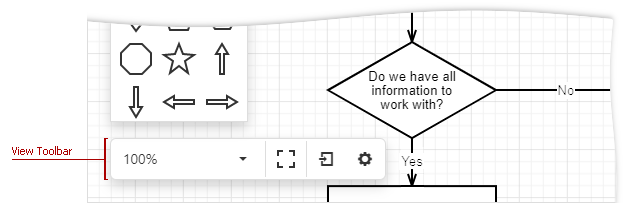
Specifies how the Diagram UI component automatically zooms the work area.
When the autoZoomMode property is set to fitContent or fitWidth, the Diagram component automatically zooms the work area when the diagram’s layout changes. You can call the fitToContent and fitToWidth methods to fit the zoom level once.
The table below lists the autoZoomMode property values and their descriptions.
| Value | Description |
|---|---|
| fitContent | Fits the diagram content into the work area. The maximum scale is 100%. |
| fitWidth | Fits the diagram content's width into the work area width. The maximum scale is 100%. |
| disabled | Auto-zoom is disabled. |
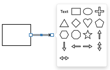
contextToolbox
Configures the context toolbox's settings.
The context toolbox appears when you draw a connector from a shape and release it without it being connected to another shape. The toolbox allows you to create a shape at the end of the connector.
customShapes[]
Provide access to an array of custom shapes.
Use the customShapes property to extend a collection of built-in shapes with custom shapes.
Use the toolbox property to add the custom shapes to the toolbox.
jQuery
$(function() {
    var diagram = $("#diagram").dxDiagram({
        customShapes: [{
            category: "hardware",
            type: "internet",
            title: "Internet",
            backgroundImageUrl: "images/shapes/internet.svg",
            backgroundImageLeft: 0.15,
            backgroundImageTop: 0,
            backgroundImageWidth: 0.7,
            backgroundImageHeight: 0.7,
            defaultWidth: 0.75,
            defaultHeight: 0.75,
            defaultText: "Internet",
            allowEditText: true,
            textLeft: 0,
            textTop: 0.7,
            textWidth: 1,
            textHeight: 0.3,
            connectionPoints: [
                { x: 0.5, y: 0 },
                { x: 0.9, y: 0.5 },
                { x: 0.5, y: 1 },
                { x: 0.1, y: 0.5 }
            ]
        },
        ...
    ],
    toolbox: {
        groups: [{ category: "hardware", title: "Hardware" }]
    }
}).dxDiagram("instance");
Angular
<dx-diagram #diagram id="diagram">
    <dxi-diagram-custom-shape
        category="hardware"
        type="internet"
        title="Internet"
        backgroundImageUrl="images/shapes/internet.svg"
        [backgroundImageLeft]="0.15"
        [backgroundImageTop]="0"
        [backgroundImageWidth]="0.7"
        [backgroundImageHeight]="0.7"
        [defaultWidth]="0.75"
        [defaultHeight]="0.75"
        defaultText="Internet"
        [allowEditText]="false"
        [textLeft]="0"
        [textTop]="0.7"
        [textWidth]="1"
        [textHeight]="0.3">
        <dxi-diagram-connection-point [x]="0.5" [y]="0"></dxi-diagram-connection-point>
        <dxi-diagram-connection-point [x]="0.9" [y]="0.5"></dxi-diagram-connection-point>
        <dxi-diagram-connection-point [x]="0.5" [y]="1"></dxi-diagram-connection-point>
        <dxi-diagram-connection-point [x]="0.1" [y]="0.5"></dxi-diagram-connection-point>
    </dxi-diagram-custom-shape>
    ...
    <dxo-diagram-toolbox>
        <dxi-diagram-group category="hardware" title="Hardware"></dxi-diagram-group>
    </dxo-diagram-toolbox>
</dx-diagram>
import { NgModule, Component, ViewChild, enableProdMode } from '@angular/core';
import { BrowserModule } from '@angular/platform-browser';
import { platformBrowserDynamic } from '@angular/platform-browser-dynamic';
import { HttpClient, HttpClientModule } from '@angular/common/http';

import { DxDiagramModule, DxDiagramComponent } from 'devextreme-angular';

@Component({
    selector: 'app-root',
    templateUrl: './app.component.html',
    styleUrls: ['./app.component.css']
})
export class AppComponent {
    @ViewChild(DxDiagramComponent, { static: false }, { static: false }) diagram: DxDiagramComponent;
    // Prior to Angular 8
    // @ViewChild(DxDiagramComponent, { static: false }) diagram: DxDiagramComponent;

    constructor(http: HttpClient) {
        http.get('data/diagram-hardware.json').subscribe(data => {
            this.diagram.instance.import(JSON.stringify(data));
        }, err => {
            throw 'Data Loading Error'
        });
    }
}
Vue
<template>
    <DxDiagram
        id="diagram"
        ref="diagram"
    >
        <DxCustomShape
            :category="'hardware'"
            :type="'internet'"
            :title="'Internet'"
            :background-image-url="'images/shapes/internet.svg'"
            :background-image-left="0.15"
            :background-image-top="0"
            :background-image-width="0.7"
            :background-image-height="0.7"
            :default-width="0.75"
            :default-height="0.75"
            :default-text="'Internet'"
            :allow-edit-text="true"
            :text-left="0"
            :text-top="0.7"
            :text-width="1"
            :text-height="0.3"
        >
            <DxConnectionPoint
                :x="0.5"
                :y="0"
            />
            <DxConnectionPoint
                :x="0.9"
                :y="0.5"
            />
            <DxConnectionPoint
                :x="0.5"
                :y="1"
            />
            <DxConnectionPoint
                :x="0.1"
                :y="0.5"
            />
        </DxCustomShape>
        ...
        <DxToolbox :visible="true">
            <DxGroup
                :category="'hardware'"
                :title="'Hardware'"
            />
        </DxToolbox>
    </DxDiagram>
</template>

<script>
import { DxDiagram, DxGroup, DxToolbox, DxCustomShape, DxConnectionPoint } from 'devextreme-vue/diagram';
import 'whatwg-fetch';

export default {
components: {
    DxDiagram, DxGroup, DxToolbox, DxCustomShape, DxConnectionPoint
},
mounted() {
    var diagram = this.$refs['diagram'].instance;
    fetch('data/diagram-hardware.json')
    .then(function(response) {
        return response.json();
    })
    .then(function(json) {
        diagram.import(JSON.stringify(json));
    })
    .catch(function() {
        throw 'Data Loading Error';
    });
}
};
</script>
React
import React from 'react';
import Diagram, { CustomShape, ConnectionPoint, Group, Toolbox } from 'devextreme-react/diagram';

class App extends React.Component {
constructor(props) {
    super(props);

    this.diagramRef = React.createRef();
}

    render() {
        return (
            <Diagram id="diagram" ref={this.diagramRef}>
                <CustomShape
                    category="hardware"
                    type="internet"
                    title="Internet"
                    backgroundImageUrl="images/shapes/internet.svg"
                    backgroundImageLeft={0.15}
                    backgroundImageTop={0}
                    backgroundImageWidth={0.7}
                    backgroundImageHeight={0.7}
                    defaultWidth={0.75}
                    defaultHeight={0.75}
                    defaultText="Internet"
                    allowEditText={true}
                    textLeft={0}
                    textTop={0.7}
                    textWidth={1}
                    textHeight={0.3}>
                <ConnectionPoint x={0.5} y={0} />
                <ConnectionPoint x={0.9} y={0.5} />
                <ConnectionPoint x={0.5} y={1} />
                <ConnectionPoint x={0.1} y={0.5} />
                </CustomShape>
                ...
                <Toolbox>
                    <Group category="hardware" title="Hardware" />
                </Toolbox>
            </Diagram>
        );
    }
}
export default App;
ASP.NET MVC Controls
@(Html.DevExtreme().Diagram()
    .ID("diagram")
    .CustomShapes(cs => {
        cs.Add()
            .Category("hardware")
            .Type("internet")
            .Title("Internet")
            .BackgroundImageUrl("../../Content/Images/shapes/internet.svg")
            .BackgroundImageLeft(0.15)
            .BackgroundImageTop(0)
            .BackgroundImageWidth(0.7)
            .BackgroundImageHeight(0.7)
            .DefaultWidth(1.9)
            .DefaultHeight(1.9)
            .DefaultText("Internet")
            .AllowEditText(true)
            .TextLeft(0)
            .TextTop(0.7)
            .TextWidth(1)
            .TextHeight(0.3)
            .ConnectionPoints(cp => {
                cp.Add().X(0.5).Y(0);
                cp.Add().X(0.9).Y(0.5);
                cp.Add().X(0.5).Y(1);
                cp.Add().X(0.1).Y(0.5);

            });
        ...
    })
    .Toolbox(tb => tb
        .Groups(g => g.Add().Category("hardware").Title("Hardware"))
    )
) See Also
customShapeTemplate
Specifies a custom template for shapes.
| Name | Type | Description |
|---|---|---|
| item |
The processed shape's object. |
Template content must be presented as SVG elements.
We recommend that you do not use the foreignObject element to define template content (Safari does not support this element).
Use the template property to define a template of an individual shape.
Set a custom shape's allowEditText option to false to disable shape text editing. Otherwise, users can add shape text that may overlap with template content.
If the textExpr option is specified, template content may overlap with text from the data source. Since the textExpr option has the default value 'text', the widget will obtain node texts from the data source’s 'text' field. To prevent this behavior, set the option to an empty string: nodes: { textExpr: "", ....
See Also
customShapeToolboxTemplate
Specifies a custom template for shapes in the toolbox.
| Name | Type | Description |
|---|---|---|
| item |
Information about the currently processed shape. |
Template content must be presented as SVG elements.
We recommend that you do not use the foreignObject element to define template content (Safari does not support this element).
Use the toolboxTemplate property to define a template for each shape in the toolbox.
See Also
defaultItemProperties
Configures default item properties.
The component applies default property values to newly created items if you do not specify the values.
jQuery
$(function() {
    $("#diagram").dxDiagram({
        nodes: {
            //...
        },
        defaultItemProperties: {
            connectorLineStart: "outlinedTriangle",
            connectorLineEnd: "none",
            connectorLineType: "straight",
            style: "fill: #d9d9d9; stroke: #999999",
            textStyle: "font-weight: bold; text-decoration: underline"
        }
    });
});
Angular
+
<dx-diagram #diagram id="diagram">
    <dxo-diagram-nodes ... ></dxo-diagram-nodes>
    <dxo-diagram-default-item-properties
        connectorLineStart="outlinedTriangle"
        connectorLineEnd="none"
        connectorLineType="straight"
        style="fill: #d9d9d9; stroke: #999999"
        textStyle="font-weight: bold; text-decoration: underline">
    </dxo-diagram-default-item-properties>
</dx-diagram>
Vue
<DxDiagram
    id="diagram"
    ref="diagram"
>
    <DxNodes ... >
    <DxDefaultItemProperties
        :connector-line-start="'outlinedTriangle'"
        :connector-line-end="'none'"
        :connector-line-type="'straight'"
        :style="'fill: #d9d9d9; stroke: #999999'"
        :text-style="'font-weight: bold; text-decoration: underline'"/>
</DxDiagram>
React
<Diagram id="diagram">
    <Nodes ... />
    <DefaultItemProperties
        connectorLineStart="outlinedTriangle"
        connectorLineEnd="none"
        connectorLineType="straight"
        textStyle="font-weight: bold; text-decoration: underline"/>
</Diagram>
disabled
Specifies whether the UI component responds to user interaction.
edges
Allows you to bind the collection of diagram edges to a data source. For more information, see the Data Binding section.
elementAttr
Specifies the global attributes to be attached to the UI component's container element.
jQuery
$(function(){
    $("#diagramContainer").dxDiagram({
        // ...
        elementAttr: {
            id: "elementId",
            class: "class-name"
        }
    });
});
Angular
<dx-diagram ...
    [elementAttr]="{ id: 'elementId', class: 'class-name' }">
</dx-diagram>
import { DxDiagramModule } from "devextreme-angular";
// ...
export class AppComponent {
    // ...
}
@NgModule({
    imports: [
        // ...
        DxDiagramModule
    ],
    // ...
})
Vue
<template>
    <DxDiagram ...
        :element-attr="diagramAttributes">
    </DxDiagram>
</template>

<script>
import DxDiagram from 'devextreme-vue/diagram';

export default {
    components: {
        DxDiagram
    },
    data() {
        return {
            diagramAttributes: {
                id: 'elementId',
                class: 'class-name'
            }
        }
    }
}
</script>
React
import React from 'react';

import Diagram from 'devextreme-react/diagram';

class App extends React.Component {
    diagramAttributes = {
        id: 'elementId',
        class: 'class-name'
    }

    render() {
        return (
            <Diagram ...
                elementAttr={this.diagramAttributes}>
            </Diagram>
        );
    }
}
export default App;
export
Configures export settings.
These settings are used when a diagram is exported via a UI.
The Export button invokes a drop-down menu that lists export commands. The following formats are supported: PNG, JPEG, and SVG.
fullScreen
Specifies whether or not to display the UI component in full-screen mode.
If the Diagram UI component is contained in a frame, the fullScreen property can be set in a user-generated event handler (a button click, a key press) for security reasons.
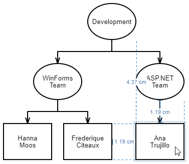
gridSize
Specifies the grid pitch.
When the showGrid property is set to true, the Diagram UI component displays grid lines that help users align diagram elements. Use the gridSize property to specify the grid pitch.
The units property specifies the measurement unit.
jQuery
$(function() {
    $("#diagram").dxDiagram({
        viewUnits: "cm",
        units: "cm",
        gridSize: {
            value: 2,
            items: [1, 2, 3]
        },
        // or
        // gridSize: 2,
    });
});
Angular
+
<dx-diagram #diagram id="diagram" viewUnits="cm" units="cm">
    <dxo-diagram-grid-size
        [value]="2"
        [items]='[1, 2, 3]'>
    </dxo-diagram-grid-size>
</dx-diagram>
Vue
<template>
<DxDiagram
    id="diagram"
    ref="diagram"
    units="cm"
    viewUnits="cm"
>
    <DxGridSize
    :value="2"
    :items="['1', '2', '3']"
    />
</DxDiagram>
</template>
React
class App extends React.Component {
    // ...
    render() {
        return (
            <Diagram id="diagram" ref={this.diagramRef} units="cm" viewUnits="cm">
                <GridSize value={2} items={[1, 2, 3]} />
            </Diagram>
        );
    }
}
See Also
hasChanges
Indicates whether diagram content has unsaved changes.
The Diagram UI component sets the hasChanges property to true after any change and never resets this value to false. You should set the hasChanges property to false after you save the component's data.
jQuery
The optionChanged event occurs when the hasChanges property value changes. Handle this event as shown below to automatically save diagram data in a storage:
var autoSaveIntervalMs = 2000;
var autoSaveTimeout = -1;

$("#diagram").dxDiagram({
onOptionChanged: function(e) {
    if(e.name === "hasChanges" && e.value && autoSaveTimeout === -1) {
        autoSaveTimeout = setTimeout(function() {
            var data = e.component.export();
            window.localStorage.setItem("foo", data); // saves data to a local storage
            autoSaveTimeout = -1;
            e.component.option("hasChanges", false);
        }, autoSaveIntervalMs);
    }
}
height
Specifies the UI component's height.
This property accepts a value of one of the following types:
Number
The height in pixels.String
A CSS-accepted measurement of height. For example,"55px","20vh","80%","inherit".
nodes
Allows you to bind the collection of diagram nodes to a data source. For more information, see the Data Binding section.
onContentReady
A function that is executed when the UI component is rendered and each time the component is repainted.
Information about the event.
| Name | Type | Description |
|---|---|---|
| element |
The UI component's container. It is an HTML Element or a jQuery Element when you use jQuery. |
|
| component |
The UI component's instance. |
onCustomCommand
A function that is executed after a custom command item was clicked and allows you to implement the custom command's logic.
Information about the event.
| Name | Type | Description |
|---|---|---|
| component |
The UI component instance's name. |
|
| element |
The UI component's container. It is an HTML Element or a jQuery Element when you use jQuery. |
|
| name |
The name of the clicked item. |
onDisposing
A function that is executed before the UI component is disposed of.
Information about the event.
| Name | Type | Description |
|---|---|---|
| element |
The UI component's container. It is an HTML Element or a jQuery Element when you use jQuery. |
|
| component |
The UI component's instance. |
onInitialized
A function used in JavaScript frameworks to save the UI component instance.
Information about the event.
| Name | Type | Description |
|---|---|---|
| element |
The UI component's container. It is an HTML Element or a jQuery Element when you use jQuery. |
|
| component |
The UI component's instance. |
Angular
<dx-diagram ...
    (onInitialized)="saveInstance($event)">
</dx-diagram>
import { Component } from "@angular/core";
import Diagram from "devextreme/ui/data_grid";
// ...
export class AppComponent {
    diagramInstance: Diagram;
    saveInstance (e) {
        this.diagramInstance = e.component;
    }
}
Vue
<template>
    <div>
        <DxDiagram ...
            @initialized="saveInstance">
        </DxDiagram>
    </div>
</template>

<script>
import DxDiagram from 'devextreme-vue/diagram';

export default {
    components: {
        DxDiagram
    },
    data: function() {
        return {
            diagramInstance: null
        };
    },
    methods: {
        saveInstance: function(e) {
            this.diagramInstance = e.component;
        }
    }
};
</script>
<template>
    <div>
        <DxDiagram ...
            @initialized="saveInstance">
        </DxDiagram>
    </div>
</template>

<script setup>
import DxDiagram from 'devextreme-vue/diagram';

let diagramInstance = null;

const saveInstance = (e) => {
    diagramInstance = e.component;
}
</script>
React
import Diagram from 'devextreme-react/diagram';

class App extends React.Component {
    constructor(props) {
        super(props);

        this.saveInstance = this.saveInstance.bind(this);
    }

    saveInstance(e) {
        this.diagramInstance = e.component;
    }

    render() {
        return (
            <div>
                <Diagram onInitialized={this.saveInstance} />
            </div>
        );
    }
}
See Also
onItemClick
A function that is executed after a shape or connector is clicked.
Information about the event.
| Name | Type | Description |
|---|---|---|
| component |
The UI component instance's name. |
|
| element |
The UI component's container. It is an HTML Element or a jQuery Element when you use jQuery. |
|
| item |
A dxDiagramItem object descendant (dxDiagramShape or dxDiagramConnector) related to the event. |
onItemDblClick
A function that is executed after a shape or connector is double-clicked.
Information about the event.
| Name | Type | Description |
|---|---|---|
| component |
The UI component instance's name. |
|
| element |
The UI component's container. It is an HTML Element or a jQuery Element when you use jQuery. |
|
| item |
A dxDiagramItem object descendant (dxDiagramShape or dxDiagramConnector) related to the event. |
onOptionChanged
A function that is executed after a UI component property is changed.
Information about the event.
| Name | Type | Description |
|---|---|---|
| value | any |
The modified property's new value. |
| previousValue | any |
The UI component's previous value. |
| name |
The modified property if it belongs to the first level. Otherwise, the first-level property it is nested into. |
|
| fullName |
The path to the modified property that includes all parent properties. |
|
| element |
The UI component's container. It is an HTML Element or a jQuery Element when you use jQuery. |
|
| component |
The UI component's instance. |
The following example shows how to subscribe to component property changes:
jQuery
$(function() {
    $("#diagramContainer").dxDiagram({
        // ...
        onOptionChanged: function(e) {
            if(e.name === "changedProperty") {
                // handle the property change here
            }
        }
    });
});
Angular
<dx-diagram ...
    (onOptionChanged)="handlePropertyChange($event)">
</dx-diagram>
import { Component } from '@angular/core';

@Component({
    selector: 'app-root',
    templateUrl: './app.component.html',
    styleUrls: ['./app.component.css']
})

export class AppComponent {
    // ...
    handlePropertyChange(e) {
        if(e.name === "changedProperty") {
            // handle the property change here
        }
    }
}
import { BrowserModule } from '@angular/platform-browser';
import { NgModule } from '@angular/core';
import { AppComponent } from './app.component';
import { DxDiagramModule } from 'devextreme-angular';

@NgModule({
    declarations: [
        AppComponent
    ],
    imports: [
        BrowserModule,
        DxDiagramModule
    ],
    providers: [ ],
    bootstrap: [AppComponent]
})

export class AppModule { }
Vue
<template>
    <DxDiagram ...
        @option-changed="handlePropertyChange"
    />
</template>

<script>
import 'devextreme/dist/css/dx.light.css';
import DxDiagram from 'devextreme-vue/diagram';

export default {
    components: {
        DxDiagram
    },
    // ...
    methods: {
        handlePropertyChange: function(e) {
            if(e.name === "changedProperty") {
                // handle the property change here
            }
        }
    }
}
</script>
React
import React from 'react';
import 'devextreme/dist/css/dx.light.css';

import Diagram from 'devextreme-react/diagram';

const handlePropertyChange = (e) => {
    if(e.name === "changedProperty") {
        // handle the property change here
    }
}

export default function App() {
    return (
        <Diagram ...
            onOptionChanged={handlePropertyChange}
        />
    );
}
onRequestEditOperation
A function that allows you to prohibit an edit operation at run time.
Information about the event.
| Name | Type | Description |
|---|---|---|
| allowed |
Specifies whether the edit operation is allowed. Default value: true. |
|
| args |
| dxDiagramAddShapeFromToolboxArgs | | | |dxDiagramChangeConnectorPointsArgs |dxDiagramBeforeChangeShapeTextArgs | |dxDiagramBeforeChangeConnectorTextArgs | | | |
An object that contains information about the processed shape or connector. The parameter's value type depends on the operation. |
| component |
The UI component instance's name. |
|
| element |
The UI component's container. It is an HTML Element or a jQuery Element when you use jQuery. |
|
| operation |
The processed operation. |
|
| reason |
Identifies the reason why the event is raised. |
The operation parameter identifies the edit operation. Note that if an Allow{Operation} property is set to false, the event does not fire for this operation. The table below lists all available operations.
| Operation | User action / IU update operation causes the event to be raised |
|---|---|
| addShape | A user is about to add a shape / The UI component determines the **Paste** command's visibility. |
| addShapeFromToolbox | The UI component determines the visibility of a shape in the toolbox or context toolbox. |
| beforeChangeConnectorText | A user is about to edit a connector's text. |
| beforeChangeShapeText | A user is about to edit a shape's text. |
| changeConnection | A user is about to link or delink a connector from a shape / The UI component determines a connection point's visibility. |
| changeConnectorPoints | A user changed a connector's points. |
| changeConnectorText | A user changed a connector's text. |
| changeShapeText | A user changed a shape's text. |
| deleteConnector | A user is about to delete a connector / The UI component determines the **Cut** and **Delete** commands' visibility. |
| deleteShape | A user is about to delete a shape / The UI component determines the visibility of the **Cut** and **Delete** commands. |
| moveShape | A user moved a shape. |
| resizeShape | A user resized a shape. |
For more information, refer to the following section: Prohibit Individual Operations
When a user pastes or clones several items in a diagram, the control adds the items to the model one by one. For each added item, the RequestEditOperation event fires. In the event handler, you can access the processed item. However, if you call the getItemById(id) method to access an attached connector (see the attachedConnectorIds property) or a container's child item (see the containerChildItemIds property), you can get the undefinedresult if the item is not added to the model yet.
See Also
onRequestLayoutUpdate
A function that allows you to specify whether or not the UI component should reapply its auto layout after diagram data is reloaded.
Information about the event.
| Name | Type | Description |
|---|---|---|
| allowed |
Specifies whether or not the diagram layout should be updated. Default value: false. |
|
| changes | Array<any> |
The received changes. |
| component |
The UI component instance's name. |
|
| element |
The UI component's container. It is an HTML Element or a jQuery Element when you use jQuery. |
The autoLayout option specifies an auto-layout algorithm that the UI component uses to build a diagram on data binding.
Write the onRequestLayoutUpdate function to specify whether the component should reapply its auto layout when a user changes diagram data in the UI or you modify the data source directly via push services.
onSelectionChanged
A function that is executed after the selection is changed in the Diagram.
Information about the event.
| Name | Type | Description |
|---|---|---|
| component |
The UI component instance's name. |
|
| element |
The UI component's container. It is an HTML Element or a jQuery Element when you use jQuery. |
|
| items |
An array of selected items (DiagramShapes or DiagramConnectors). |
pageColor
Specifies the color of a diagram page.
The following color formats are available:
Longhand and shorthand hexadecimal notations. For example,
"#3b3","#31bb32".RGB and RGBA formats. For example,
"rgb(51,187,51)","rgba(0,204,0,1)".Named colors. For example,
"darkturquoise".
pageSize
Specifies a size of pages.
The units property specifies the page's measurement units.
jQuery
$(function() {
    $("#diagram").dxDiagram({
        units: "cm",
        pageSize: {
            width: 10,
            height: 10,
        },
    });
});
Angular
+
<dx-diagram #diagram id="diagram" units="cm">
    <dxo-diagram-page-size [width]="10" [height]="10">
    </dxo-diagram-page-size>
</dx-diagram>
Vue
<template>
<DxDiagram
    id="diagram"
    ref="diagram"
    units="cm"
>
    <DxPageSize
    :width="10"
    :height="10"
    />
</DxDiagram>
</template>
React
class App extends React.Component {
    // ...
    render() {
        return (
            <Diagram id="diagram" ref={this.diagramRef} units="cm">
                <PageSize width={10} height={10} />
            </Diagram>
        );
    }
}readOnly
Specifies whether the diagram is read-only.
Set the readOnly property to true to prohibit users from editing the diagram.
rtlEnabled
Switches the UI component to a right-to-left representation.
When this property is set to true, the UI component text flows from right to left, and the layout of elements is reversed. To switch the entire application/site to the right-to-left representation, assign true to the rtlEnabled field of the object passed to the DevExpress.config(config) method.
DevExpress.config({
    rtlEnabled: true
});simpleView
Switch the Diagram UI component to simple view mode.
In simple view mode, the control does not divide the work area into pages and the diagram's content occupies all the available area inside the component.
units
Specifies the measurement unit for size properties.
The units property specifies the unit for measurements in a diagram, for instance, defaultHeight (custom shape properties), gridSize (grid properties), or leftExpr (node and edge data-bound settings).
User interface elements display measurements in viewUnits.
When you export a diagram, the component saves the diagram's data in its own text format. The resulting JSON object contains measurements in twips, regardless of the units or viewUnits property values. Do not modify this JSON object because modified data can load incorrectly.
useNativeScrolling
Specifies whether or not the UI component uses native scrolling.
viewUnits
Specifies the measurement unit that is displayed in user interface elements.
The viewUnits property specifies the measurement unit in Properties panel and in the Diagram work area.
Use the units property specifies the unit for measurements in a diagram, for instance, defaultHeight (custom shape properties), gridSize (grid properties), or leftExpr (node and edge data-bound settings).
When you export a diagram, the component saves the diagram's data in its own text format. The resulting JSON object contains measurements in twips, regardless of the units or viewUnits property values. Do not modify this JSON object because modified data can load incorrectly.
width
Specifies the UI component's width.
This property accepts a value of one of the following types:
Number
The width in pixels.String
A CSS-accepted measurement of width. For example,"55px","20vw","80%","auto","inherit".
zoomLevel
Specifies the zoom level.
jQuery
$(function() {
    $("#diagram").dxDiagram({
        zoomLevel: {
            value: 0.75,
            items: [0.5, 0.75, 1, 1.5]
        },
    });
});
Angular
+
<dx-diagram #diagram id="diagram">
    <dxo-diagram-zoom-level
        [value]="0.75"
        [items]='[0.5, 0.75, 1, 1.5]'>
    </dxo-diagram-zoom-level>
</dx-diagram>
Vue
<template>
<DxDiagram
    id="diagram"
    ref="diagram"
>
    <DxZoomLevel
    :value="0.75"
    :items="['0.5', '0.75', '1', '1.5']"
    />
</DxDiagram>
</template>
React
class App extends React.Component {
    // ...
    render() {
        return (
            <Diagram id="diagram" ref={this.diagramRef} >
                <ZoomLevel value={0.75} items={['0.5', '0.75', '1', '1.5']}/>
            </Diagram>
        );
    }
}
 Select one or more answers