JavaScript/jQuery FilterBuilder Options
An object defining the FilterBuilder UI component's configuration properties.
See Also
accessKey
Specifies the shortcut key that sets focus on the UI component.
The value of this property will be passed to the accesskey attribute of the HTML element that underlies the UI component.
activeStateEnabled
Specifies whether the UI component changes its visual state as a result of user interaction.
The UI component switches to the active state when users press down the primary mouse button. When this property is set to true, the CSS rules for the active state apply. You can change these rules to customize the component.
Use this property when you display the component on a platform whose guidelines include the active state change for UI components.
allowHierarchicalFields
Specifies whether the UI component can display hierarchical data fields.
See Also
disabled
Specifies whether the UI component responds to user interaction.
elementAttr
Specifies the global attributes to be attached to the UI component's container element.
jQuery
$(function(){
    $("#filterBuilderContainer").dxFilterBuilder({
        // ...
        elementAttr: {
            id: "elementId",
            class: "class-name"
        }
    });
});
Angular
<dx-filter-builder ...
    [elementAttr]="{ id: 'elementId', class: 'class-name' }">
</dx-filter-builder>
import { DxFilterBuilderModule } from "devextreme-angular";
// ...
export class AppComponent {
    // ...
}
@NgModule({
    imports: [
        // ...
        DxFilterBuilderModule
    ],
    // ...
})
Vue
<template>
    <DxFilterBuilder ...
        :element-attr="filterBuilderAttributes">
    </DxFilterBuilder>
</template>

<script>
import DxFilterBuilder from 'devextreme-vue/filter-builder';

export default {
    components: {
        DxFilterBuilder
    },
    data() {
        return {
            filterBuilderAttributes: {
                id: 'elementId',
                class: 'class-name'
            }
        }
    }
}
</script>
React
import React from 'react';

import FilterBuilder from 'devextreme-react/filter-builder';

class App extends React.Component {
    filterBuilderAttributes = {
        id: 'elementId',
        class: 'class-name'
    }

    render() {
        return (
            <FilterBuilder ...
                elementAttr={this.filterBuilderAttributes}>
            </FilterBuilder>
        );
    }
}
export default App;
fields[]
Configures fields.
This property accepts an array of objects, each configuring a filter condition's appearance. Each condition consists of a data field, operation and value. A logical operation can combine conditions on the same level in a group.
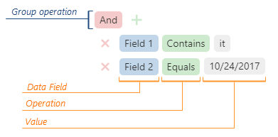
See the Field section for details on fields you can specify in each object.
filterOperationDescriptions
Specifies filter operation descriptions.
The following code sample illustrates how to set this property:
jQuery
$(function() {
    $("#filterBuilderContainer").dxFilterBuilder({
        // ...
        filterOperationDescriptions: {
            startsWith: "Begins with"
        }
    });
});
Angular
<dx-filter-builder ... >
    <dxo-filter-builder-filter-operation-descriptions
        startsWith="Begins with">
    </dxo-filter-builder-filter-operation-descriptions>
</dx-filter-builder>
import { BrowserModule } from '@angular/platform-browser';
import { NgModule } from '@angular/core';
import { AppComponent } from './app.component';

import { DxFilterBuilderModule } from 'devextreme-angular';

@NgModule({
    declarations: [
        AppComponent
    ],
    imports: [
        BrowserModule,
        DxFilterBuilderModule
    ],
    providers: [ ],
    bootstrap: [AppComponent]
})
export class AppModule { }
Vue
<template>
    <DxFilterBuilder ... >
        <DxFilterOperationDescriptions
            starts-with="Begins with"
        />
    </DxFilterBuilder>
</template>

<script>
import 'devextreme/dist/css/dx.light.css';

import DxFilterBuilder, {
    DxFilterOperationDescriptions
} from 'devextreme-vue/filter-builder';

export default {
    components: {
        DxFilterBuilder,
        DxFilterOperationDescriptions
    },
    // ...
}
</script>
React
import 'devextreme/dist/css/dx.light.css';

import FilterBuilder, {
    FilterOperationDescriptions
} from 'devextreme-react/filter-builder';

export default function App() {
    return (
        <FilterBuilder ... >
            <FilterOperationDescriptions
                startsWith="Begins with"
            />
        </FilterBuilder>
    );
}
See Also
- fields[].filterOperations
focusStateEnabled
Specifies whether the UI component can be focused using keyboard navigation.
groupOperationDescriptions
Specifies group operation descriptions.
The following code sample illustrates how to set this property:
jQuery
$(function() {
    $("#filterBuilderContainer").dxFilterBuilder({
        // ...
        groupOperationDescriptions: {
            and: "Plus"
        }
    });
});
Angular
<dx-filter-builder ... >
    <dxo-filter-builder-group-operation-descriptions
        and="Plus">
    </dxo-filter-builder-group-operation-descriptions>
</dx-filter-builder>
import { BrowserModule } from '@angular/platform-browser';
import { NgModule } from '@angular/core';
import { AppComponent } from './app.component';

import { DxFilterBuilderModule } from 'devextreme-angular';

@NgModule({
    declarations: [
        AppComponent
    ],
    imports: [
        BrowserModule,
        DxFilterBuilderModule
    ],
    providers: [ ],
    bootstrap: [AppComponent]
})
export class AppModule { }
Vue
<template>
    <DxFilterBuilder ... >
        <DxGroupOperationDescriptions
            and="Plus"
        />
    </DxFilterBuilder>
</template>

<script>
import 'devextreme/dist/css/dx.light.css';

import DxFilterBuilder, {
    DxGroupOperationDescriptions
} from 'devextreme-vue/filter-builder';

export default {
    components: {
        DxFilterBuilder,
        DxGroupOperationDescriptions
    },
    // ...
}
</script>
React
import 'devextreme/dist/css/dx.light.css';

import FilterBuilder, {
    GroupOperationDescriptions
} from 'devextreme-react/filter-builder';

export default function App() {
    return (
        <FilterBuilder ... >
            <GroupOperationDescriptions
                and="Plus"
            />
        </FilterBuilder>
    );
}
See Also
groupOperations
Specifies a set of available group operations.
The group operations are:
- "and"
- "notAnd"
Returns a reverted result of an "and" operation:["!", [[condition1], "and", [condition2]]]. - "or"
- "notOr"
Returns a reverted result of an "or" operation:["!", [[condition1], "or", [condition2]]].
See Also
height
Specifies the UI component's height.
This property accepts a value of one of the following types:
Number
The height in pixels.String
A CSS-accepted measurement of height. For example,"55px","20vh","80%","inherit".
hint
Specifies text for a hint that appears when a user pauses on the UI component.
hoverStateEnabled
Specifies whether the UI component changes its state when a user pauses on it.
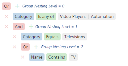
maxGroupLevel
Specifies groups' maximum nesting level.
Assign 0 to this property to disallow new groups, 1 - to allow new first-level groups, 2 - to allow new first- and second-level groups, and so on.
onContentReady
A function that is executed when the UI component is rendered and each time the component is repainted.
Information about the event.
| Name | Type | Description |
|---|---|---|
| element |
The UI component's container. It is an HTML Element or a jQuery Element when you use jQuery. |
|
| component |
The UI component's instance. |
onDisposing
A function that is executed before the UI component is disposed of.
Information about the event.
| Name | Type | Description |
|---|---|---|
| element |
The UI component's container. It is an HTML Element or a jQuery Element when you use jQuery. |
|
| component |
The UI component's instance. |
onEditorPrepared
A function that is executed after an editor is created.
Information about the event.
| Name | Type | Description |
|---|---|---|
| component |
The UI component's instance. |
|
| dataField |
The data field's name. |
|
| disabled |
Indicates whether the editor is disabled. |
|
| editorElement |
The editor's container. It is an HTML Element or a jQuery Element when you use jQuery. |
|
| editorName |
The editor's name. |
|
| element |
The UI component's container. It is an HTML Element or a jQuery Element when you use jQuery. |
|
| filterOperation |
The applied filter operation. |
|
| readOnly |
Indicates whether the editor is read-only. |
|
| rtlEnabled |
Indicates whether the editor uses right-to-left representation. |
|
| setValue | any |
A method you need to call to change the field's value after the editor's value changes. |
| updateValueTimeout |
Gets and sets the delay between when a user stops typing the field's value and when the change is applied. |
|
| value | any |
The editor's value. |
| width |
The editor's width. |
The UI component offers users different editors to enter a value depending on the field's dataType: Calendar, TextBox, SelectBox, and so on. Use this function to customize those editors.
onEditorPreparing
A function that is executed before an editor is created.
Information about the event.
| Name | Type | Description |
|---|---|---|
| cancel |
Allows you to cancel the creation of the editor. |
|
| component |
The UI component's instance. |
|
| dataField |
The data field's name. |
|
| disabled |
Indicates whether the editor is disabled. |
|
| editorElement |
The editor's container. It is an HTML Element or a jQuery Element when you use jQuery. |
|
| editorName |
Allows you to change the editor. Accepts names of DevExtreme UI components only, for example, "dxTextBox". |
|
| editorOptions |
Gets and sets the editor configuration. |
|
| element |
The UI component's container. It is an HTML Element or a jQuery Element when you use jQuery. |
|
| filterOperation |
The applied filter operation. |
|
| readOnly |
Indicates whether the editor is read-only. |
|
| rtlEnabled |
Indicates whether the editor uses right-to-left representation. |
|
| setValue | any |
A method you should call to change the field's value after the editor's value changes. |
| updateValueTimeout |
Gets and sets the delay between when a user stops typing the field value and when the change is applied. |
|
| value | any |
Editor value. This field is read-only. To change the editor value, use the setValue(newValue) function parameter. |
| width |
The editor's width. |
The FilterBuilder offers users different editors used to enter a value depending on the field's dataType: Calendar, TextBox, SelectBox, and so on. Use this function to customize those default editors or substitute them for other editors.
In the following code, the DevExtreme TextArea UI component replaces the default editor. Note that the onValueChanged function declaration ends with the setValue(newValue, newText) method's call. This method updates the value.
jQuery
$(function() {
    $("#filterBuilder").dxFilterBuilder({
        // ...
        onEditorPreparing: function (e) {
            if (e.dataField == "description") {
                e.editorName = "dxTextArea";
                e.editorOptions.showClearButton = true;
                e.editorOptions.onValueChanged = function(event) {
                    const value = event.value;
                    e.setValue(value.toLowerCase());
                }
            }
        }
    });
});
Angular
import { DxFilterBuilderModule } from "devextreme-angular";
// ...
export class AppComponent {
    onEditorPreparing (e) {
        if (e.dataField == "description") {
            e.editorName = "dxTextArea";
            e.editorOptions.showClearButton = true;
            e.editorOptions.onValueChanged = (event) => {
                const value = event.value;
                e.setValue(value.toLowerCase());
            }
        }
    }
}
@NgModule({
    imports: [
        // ...
        DxFilterBuilderModule
    ],
    // ...
})
<dx-filter-builder ...
    (onEditorPreparing)="onEditorPreparing($event)">
</dx-filter-builder>
Vue
<template>
    <DxFilterBuilder ...
        @editor-preparing="onEditorPreparing">
    </DxFilterBuilder>
</template>

<script>
import 'devextreme/dist/css/dx.light.css';

import DxFilterBuilder from 'devextreme-vue/filter-builder';

export default {
    components: {
        DxFilterBuilder
    },
    // ...
    methods: {
        onEditorPreparing (e) {
            if (e.dataField == "description") {
                e.editorName = "dxTextArea";
                e.editorOptions.showClearButton = true;
                e.editorOptions.onValueChanged = (event) => {
                    const value = event.value;
                    e.setValue(value.toLowerCase());
                }
            }
        }
    }
}
</script>
React
import React from 'react';

import 'devextreme/dist/css/dx.light.css';

import FilterBuilder from 'devextreme-react/filter-builder';

class App extends React.Component {
    onEditorPreparing (e) {
        if (e.dataField == "description") {
            e.editorName = "dxTextArea";
            e.editorOptions.showClearButton = true;
            e.editorOptions.onValueChanged = (event) => {
                const value = event.value;
                e.setValue(value.toLowerCase());
            }
        }
    }
    render() {
        return (
            <FilterBuilder ...
                onEditorPreparing={this.onEditorPreparing}>
            </FilterBuilder>
        );
    }
}
export default App;onInitialized
A function used in JavaScript frameworks to save the UI component instance.
Information about the event.
| Name | Type | Description |
|---|---|---|
| element |
The UI component's container. It is an HTML Element or a jQuery Element when you use jQuery. |
|
| component |
The UI component's instance. |
Angular
<dx-filter-builder ...
    (onInitialized)="saveInstance($event)">
</dx-filter-builder>
import { Component } from "@angular/core";
import FilterBuilder from "devextreme/ui/data_grid";
// ...
export class AppComponent {
    filterBuilderInstance: FilterBuilder;
    saveInstance (e) {
        this.filterBuilderInstance = e.component;
    }
}
Vue
<template>
    <div>
        <DxFilterBuilder ...
            @initialized="saveInstance">
        </DxFilterBuilder>
    </div>
</template>

<script>
import DxFilterBuilder from 'devextreme-vue/filter-builder';

export default {
    components: {
        DxFilterBuilder
    },
    data: function() {
        return {
            filterBuilderInstance: null
        };
    },
    methods: {
        saveInstance: function(e) {
            this.filterBuilderInstance = e.component;
        }
    }
};
</script>
<template>
    <div>
        <DxFilterBuilder ...
            @initialized="saveInstance">
        </DxFilterBuilder>
    </div>
</template>

<script setup>
import DxFilterBuilder from 'devextreme-vue/filter-builder';

let filterBuilderInstance = null;

const saveInstance = (e) => {
    filterBuilderInstance = e.component;
}
</script>
React
import FilterBuilder from 'devextreme-react/filter-builder';

class App extends React.Component {
    constructor(props) {
        super(props);

        this.saveInstance = this.saveInstance.bind(this);
    }

    saveInstance(e) {
        this.filterBuilderInstance = e.component;
    }

    render() {
        return (
            <div>
                <FilterBuilder onInitialized={this.saveInstance} />
            </div>
        );
    }
}
See Also
onOptionChanged
A function that is executed after a UI component property is changed.
Information about the event.
| Name | Type | Description |
|---|---|---|
| value | any |
The modified property's new value. |
| previousValue | any |
The UI component's previous value. |
| name |
The modified property if it belongs to the first level. Otherwise, the first-level property it is nested into. |
|
| fullName |
The path to the modified property that includes all parent properties. |
|
| element |
The UI component's container. It is an HTML Element or a jQuery Element when you use jQuery. |
|
| component |
The UI component's instance. |
The following example shows how to subscribe to component property changes:
jQuery
$(function() {
    $("#filterBuilderContainer").dxFilterBuilder({
        // ...
        onOptionChanged: function(e) {
            if(e.name === "changedProperty") {
                // handle the property change here
            }
        }
    });
});
Angular
<dx-filter-builder ...
    (onOptionChanged)="handlePropertyChange($event)">
</dx-filter-builder>
import { Component } from '@angular/core';

@Component({
    selector: 'app-root',
    templateUrl: './app.component.html',
    styleUrls: ['./app.component.css']
})

export class AppComponent {
    // ...
    handlePropertyChange(e) {
        if(e.name === "changedProperty") {
            // handle the property change here
        }
    }
}
import { BrowserModule } from '@angular/platform-browser';
import { NgModule } from '@angular/core';
import { AppComponent } from './app.component';
import { DxFilterBuilderModule } from 'devextreme-angular';

@NgModule({
    declarations: [
        AppComponent
    ],
    imports: [
        BrowserModule,
        DxFilterBuilderModule
    ],
    providers: [ ],
    bootstrap: [AppComponent]
})

export class AppModule { }
Vue
<template>
    <DxFilterBuilder ...
        @option-changed="handlePropertyChange"
    />
</template>

<script>
import 'devextreme/dist/css/dx.light.css';
import DxFilterBuilder from 'devextreme-vue/filter-builder';

export default {
    components: {
        DxFilterBuilder
    },
    // ...
    methods: {
        handlePropertyChange: function(e) {
            if(e.name === "changedProperty") {
                // handle the property change here
            }
        }
    }
}
</script>
React
import React from 'react';
import 'devextreme/dist/css/dx.light.css';

import FilterBuilder from 'devextreme-react/filter-builder';

const handlePropertyChange = (e) => {
    if(e.name === "changedProperty") {
        // handle the property change here
    }
}

export default function App() {
    return (
        <FilterBuilder ...
            onOptionChanged={handlePropertyChange}
        />
    );
}
onValueChanged
A function that is executed after the UI component's value is changed.
Information about the event.
| Name | Type | Description |
|---|---|---|
| component |
The UI component's instance. |
|
| element |
The UI component's container. It is an HTML Element or a jQuery Element when you use jQuery. |
|
| previousValue |
The UI component's previous value. |
|
| value |
The UI component's new value. |
rtlEnabled
Switches the UI component to a right-to-left representation.
When this property is set to true, the UI component text flows from right to left, and the layout of elements is reversed. To switch the entire application/site to the right-to-left representation, assign true to the rtlEnabled field of the object passed to the DevExpress.config(config) method.
DevExpress.config({
    rtlEnabled: true
});tabIndex
Specifies the number of the element when the Tab key is used for navigating.
The value of this property will be passed to the tabindex attribute of the HTML element that underlies the UI component.
value
Allows you to specify a filter.
See Also

 Select one or more answers