Vue CircularGauge - RangeBar
An object that defines a gauge indicator of the rangeBar type.
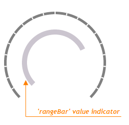
Value Indicator
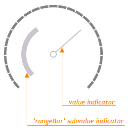
Subvalue Indicator
backgroundColor
Specifies the background color for the indicator of the rangeBar type.
baseValue
Specifies the base value for the indicator of the rangeBar type.
By default, a range bar starts from the beginning of the gauge scale. If you need to draw the range bar starting from a specific scale value, assign the required value to the baseValue option. In this instance, the range bar will display the range from the baseValue to the main gauge value.
offset
Specifies the distance between the indicator and the invisible scale line.
palette
Sets the array of colors to be used for coloring subvalue indicators.
Use this option to color subvalue indicators. If the number of colors in the specified array is less than the number of subvalue indicators, the colors are repeated, but slightly modified.
If you need to draw all subvalue indicators in one color, specify the subvalueIndicator.color option.
When using the widget as an ASP.NET MVC Control, you can specify this option using the VizPalette enum. This enum accepts the following values: Default, SoftPastel, HarmonyLight, Pastel, Bright, Soft, Ocean, Vintage, Violet, Carmine, DarkMoon, SoftBlue, DarkViolet and GreenMist.

 Select one or more answers