Vue Form - GroupItem
This article describes configuration options of a group form item.
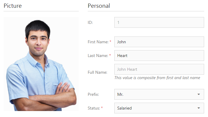
A group form item is a section consisting of a caption and child form items. You can customize the layout options for each group separately.
See Also
alignItemLabels
Specifies whether or not all group item labels are aligned.
colCount
The count of columns in the group layout.
For extra small screens, this option always equals 1 to make the widget adaptive. Specify the colCountByScreen option to override this logic.
jQuery
$(function() {
    $("#formContainer").dxForm({
        // ...
        items: [{
            itemType: "group",
            items: [ ... ],
            colCountByScreen: {
                xs: 2
            }
        },
        // ...
        ]
    });
});
Angular
<dx-form ... >
    <dxi-item
        itemType="group"
        [items]="[ ... ]">
        <dxo-col-count-by-screen [xs]="2"></dxo-col-count-by-screen>
    </dxi-item>
</dx-form>
import { DxFormModule } from 'devextreme-angular';
// ...
export class AppComponent {
    // ...
}
@NgModule({
    imports: [
        // ...
        DxFormModule
    ],
    // ...
})
See Also
colCountByScreen
Specifies dependency between the screen factor and the count of columns in the group layout.
colSpan
Specifies the number of columns spanned by the item.
See Also
cssClass
Specifies a CSS class to be applied to the form item.
In Form, you can customize the appearance of form items using CSS styles. To apply a style to an item, implement a CSS class, which may contain various properties, and assign the name of this class to the cssClass option of the item.
items
Holds an array of form items displayed within the group.
Array<Simple Form Item | Group Form Item | Tabbed Form Item | Empty Form Item>
Like the items option of the Form widget, the array passed to the items field of a group item can hold items of the following types.
Simple
A standard item consisting of a label and an editor widget used to specify a value of the associated data field.Group
An item representing a container of other form items.Tabbed
An item representing a tabbed container of other form items.Empty
An empty item used to add a space between neighboring items.
itemType
Specifies the type of the current item.
The structure of the form item object depends on the value of this option.
This article describes the structure of an item whose type is "group". The following item types are also available.
simple
Simple item is an editor-label pair usually bound to a formData object field used to display and modify this field.tabbed
Tabbed item is a tabbed panel whose tabs contain child form items. You can customize the layout options for each tab separately.empty
Empty item is an empty span between neighboring items. You can specify the number of columns spanned by an empty item.
name
Specifies a name that identifies the form item.
Use the name to access the form item in methods like itemOption(id).
template
A template to be used for rendering a group item.
Use the template option of a group item to display custom content under a group caption, for instance an image. To specify a custom template for items contained in a group, define the template option of each of these items.
See Also

 Select one or more answers