JavaScript/jQuery DataGrid Options
This section describes the configuration options of the DataGrid widget.
accessKey
Specifies the shortcut key that sets focus on the widget.
The value of this option will be passed to the accesskey attribute of the HTML element that underlies the widget.
activeStateEnabled
Specifies whether or not the widget changes its state when interacting with a user.
This option is used when the widget is displayed on a platform whose guidelines include the active state change for widgets.
allowColumnReordering
Specifies whether a user can reorder columns.
Initially, columns appear in the order specified by the columns array. If you skip specifying this array, columns will mirror the order of fields in the first object from the dataSource. You can allow a user to reorder columns at runtime by setting the allowColumnReordering option to true.
See Also
- columns[].allowReordering
allowColumnResizing
Specifies whether a user can resize columns.
By default, the width of each column depends on the width of the widget and the total number of columns. You can allow a user to resize the columns at runtime by setting the allowColumnResizing option to true.
See Also
- columnResizingMode
- columns[].allowResizing
- columns[].width
cacheEnabled
Specifies whether data should be cached.
When this option is set to true, data loaded once is saved in cache. Then, the widget takes data from this cache when performing such operations as sorting, grouping, paging, etc. Caching is helpful when the data source takes significant time to load. But, consider disabling it for frequently changing data sources.
To update data in cache, call the refresh() method of the widget or the load() method of the DataSource.
See Also
cellHintEnabled
Enables a hint that appears when a user hovers the mouse pointer over a cell with truncated content.
The cell's content may be truncated if the width of the cell's column becomes very small. In this case, when a user hovers the mouse pointer over such a cell, a hint containing the cell's value appears. To disable cell hints, assign false to the cellHintEnabled option.
columnAutoWidth
Specifies whether columns should adjust their widths to the content.
When this option is set to true, all columns adjust their widths to the content. This setting may cause horizontal scrolling, but only if the overall content is longer than the width of the widget. In this case, you can fix those columns that you consider pivotal so that they were constantly on screen.
When this option is set to false, all columns have identical widths that depend on the width of the widget.
See Also
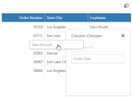
columnChooser
Configures the column chooser.
The column chooser allows a user to hide columns at runtime. To enable it, assign true to the columnChooser.enabled option.
See Also
- Column Chooser
- columns[].allowHiding
columnFixing
Configures column fixing.
When the width of all columns exceeds the widget width, horizontal scrolling appears. If specific columns should be on screen constantly regardless of how far the widget is scrolled, allow a user to fix them at runtime using the context menu. For this, set the columnFixing.enabled option to true.
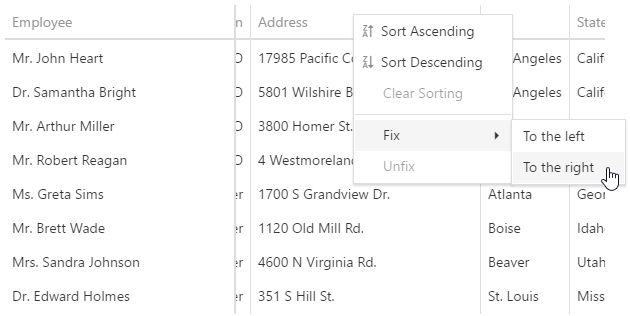
When you enable column fixing, command columns become fixed automatically.
See Also
columnHidingEnabled
Specifies whether the widget should hide columns to adapt to the screen or container size. Ignored if allowColumnResizing is true and columnResizingMode is "widget".
This option set to true makes the widget hide certain columns automatically if all the columns do not fit the widget's width. Columns with low hidingPriority are hidden first. These are the rightmost (leftmost if rtlEnabled is true) columns by default. Information from hidden columns is available in an adaptive detail row.
See Also
columnMinWidth
Specifies the minimum width of columns.
See Also
- columns[].minWidth
- allowColumnResizing
- columnResizingMode
columnResizingMode
Specifies how the widget resizes columns. Applies only if allowColumnResizing is true.
The columnResizingMode option accepts one of the following values:
- nextColumn
When a user resizes a column, the width of the next column changes. - widget
When a user resizes a column, the width of the widget changes.
This mode is ignored if you specify the width of any column in percent.
columns[]
An array of grid columns.
By default, a column is created for each field of a data source object, but in most cases, it is redundant. To specify a set of columns to be created in a grid, assign an array specifying these columns to the columns option. Each grid column is represented in this array by an object containing column settings or by a data source field that this column is bound to. Detailed information on specifying grid columns is given in the Columns Overview article.
Column options define the behavior and appearance of a grid column. One of the other capabilities allows you to control the sorting of column values using the allowSorting and sortOrder options, apply a filter to grid records using the allowFiltering and filterOperations options, and group grid records using the allowGrouping and groupIndex options. In addition, you can change the visibility and width of a column using corresponding options.
To get or set an option or several options for a column at runtime, use the columnOption method with the required arguments.
See Also
customizeColumns
Specifies a function that customizes grid columns after they are created.
All column configurations.
Usually, each column in DataGrid is configured individually using options within the objects of the columns array. In most cases, configuring grid columns in this fashion is sufficient to make them appear appropriately. However, there may be scenarios when columns are generated on the base of a data source and you need to adjust a few of their options. In that case, you do not need to declare the columns array. Instead, change the required options within a callback function assigned to the customizeColumns option. An array of grid columns can be accessed using the function parameter. Fields of each object in this array represent column options identical to the options described in the columns reference section.
customizeExportData
Customizes data before exporting.
All column configurations.
The Row objects. This array contains only the exported rows.
This function is called between the onExporting and onExported functions. This function customizes data; the other functions can be used to customize grid columns.
In the following code, the customizeExportData function replaces empty values with the "Is Blank" value:
jQuery
$(function() {
    $("#dataGridContainer").dxDataGrid({
        // ...
        customizeExportData: function (columns, rows) {
            rows.forEach(function (row) {
                var rowValues = row.values;
                for (var i = 0; i < rowValues.length; i++) {
                    if (rowValues[i] == "")
                        rowValues[i] = "Is Blank";
                }
            })
        }
    });
});
Angular
import { DxDataGridModule } from 'devextreme-angular';
// ...
export class AppComponent {
    customizeExportData (columns, rows) {
        rows.forEach(function (row) {
            let rowValues =  row.values;
            for(let i = 0; i < rowValues.length; i++) {
                if (rowValues[i] == "")
                    rowValues[i] = "Is Blank";
            }
        })
    };
}
@NgModule({
    imports: [
        // ...
        DxDataGridModule
    ],
    // ...
})
<dx-data-grid ...
    [customizeExportData]="customizeExportData">
</dx-data-grid>
See Also
- Client-Side Exporting
- export.enabled
- columns[].allowExporting
dataSource
Specifies the origin of data for the widget.
This option accepts one of the following:
Array of Objects
A simple JavaScript array containing a collection of plain objects.URL
A URL to JSON data or to a service returning data in JSON format.DataSource or its configuration object
A DataSource is an object that provides a handy API for data processing. A DataSource is a stateful object, which means that it saves data processing settings and applies them each time data is loaded. All underlying data access logic of a DataSource is isolated in a Store. A Store provides an API for reading and modifying data. Unlike the DataSource, a Store is a stateless object.NOTEIf you use data mapping, features like export and selection may work incorrectly. We recommend using calculated columns instead of mapping.
., ,, :, [, and ]. Their presence may cause issues in the widget's operation.The widget cannot track changes that a third party makes in the data source. To bring data in the widget up to date in this case, call the refresh() method.
See Also
dateSerializationFormat
Specifies date-time values' serialization format. Use it only if you do not specify the dataSource at design time.
Without a data source, the widget cannot detect the date-time values' format. In this case, specify the dateSerializationFormat option that supports the following formats:
"yyyy-MM-dd"- a local date"yyyy-MM-ddTHH:mm:ss"- local date and time"yyyy-MM-ddTHH:mm:ssZ"- the UTC date and time"yyyy-MM-ddTHH:mm:ssx"- date and time with a timezone
This option applies only if the forceIsoDateParsing field is set to true in the global configuration object.
editing
Configures editing.
The widget can allow a user to add, update and delete data. To control which of these operations are allowed, use the allowAdding, allowUpdating and allowDeleting options. Editing can be carried out in different modes, which are detailed in the mode option's description.
See Also
elementAttr
Specifies the attributes to be attached to the widget's root element.
You can configure this option in an ASP.NET MVC Control as follows:
@(Html.DevExtreme().WidgetName()
    .ElementAttr("class", "class-name")
    // ===== or =====
    .ElementAttr(new {
        @id = "elementId",
        @class = "class-name"
    })
    // ===== or =====
    .ElementAttr(new Dictionary<string, object>() {
        { "id", "elementId" },
        { "class", "class-name" }
    })

)
@(Html.DevExtreme().WidgetName() _
.ElementAttr("class", "class-name")
' ===== or =====
.ElementAttr(New With {
.id = "elementId",
.class = "class-name"
})
' ===== or =====
.ElementAttr(New Dictionary(Of String, Object) From {
{ "id", "elementId" },
{ "class", "class-name" }
})
)errorRowEnabled
Indicates whether to show the error row.
The error row displays data-related errors that may occur on the server during the widget's runtime. Setting this option to false hides the error row, but the errors can still be viewed in the browser's console.
See Also
export
Configures client-side exporting.
When client-side exporting is enabled, the grid toolbar contains the Export button (  ) that exports grid data to Excel. For details on exporting, refer to the Client-Side Exporting article.
filterRow
Configures the filter row.
The filter row allows a user to filter data by values of individual columns.
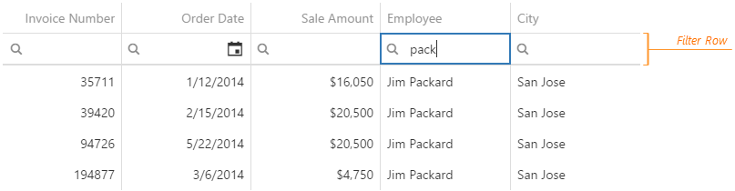
Each cell in the filter row contains a magnifying glass icon, pausing on which opens a drop-down list with filters available for the column.
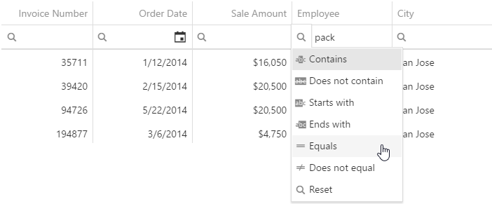
To make the filter row visible, assign true to the filterRow.visible option.
See Also
focusStateEnabled
Specifies whether the widget can be focused using keyboard navigation.
groupPanel
Configures the group panel.
Data in DataGrid can be grouped by one column or by several. Once a column is used for grouping, it is added to the group panel.
By default, the group panel is hidden. To make it visible, set the groupPanel.visible option to true. Alternatively, the visibility of the group panel can depend on the device's screen size. To accomplish this behavior, set the visible option to "auto".
In case you need to show the group panel, but make it irresponsive, assign false to the groupPanel.allowColumnDragging option. This is useful, for instance, when grid records are grouped initially and when the user needs to know about that grouping, but must not be able to change it.
See Also
- Grouping
- grouping.contextMenuEnabled - enables the user to group data using the context menu.
- columns[].allowGrouping - disallows grouping for an individual column.
headerFilter
Configures the header filter feature.
A header filter allows a user to filter values in an individual column by including/excluding them in/from the applied filter. A click on a header filter icon invokes a popup menu with all unique values in the column. By selecting or clearing the selection of values in this menu, the user includes/excludes them in/from the filter.
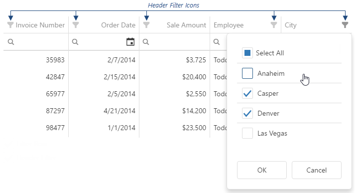
To make header filter icons visible, assign true to the headerFilter.visible option. Data in the popup menu can be customized using the headerFilter option of a specific column.
See Also
height
Specifies the widget's height.
This option accepts a value of one of the following types:
Number
The height in pixels.String
A CSS-accepted measurement of height. For example,"55px","80%","auto","inherit".Function
A function returning either of the above. For example:JavaScriptheight: function() { return window.innerHeight / 1.5; }
hint
Specifies text for a hint that appears when a user pauses on the widget.
hoverStateEnabled
Specifies whether to highlight rows when a user moves the mouse pointer over them.
keyExpr
Specifies which data field provides data items' keys. Applies only if data is a JavaScript array.
See Also
- key in ArrayStore | CustomStore | LocalStore | ODataStore
loadPanel
Configures the load panel.
The load panel is displayed while the widget loads data. It consists of a loading indicator and text, both placed on a pane.
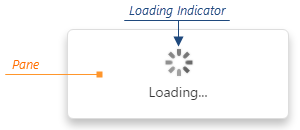
Since the load panel is, in fact, the DevExtreme LoadPanel widget, the loadPanel object can contain any options of this widget along with options described here.
See Also
masterDetail
Allows you to build a master-detail interface in the grid.
In DataGrid, a master-detail interface supplies a usual data row with an expandable section that contains the details on this data row. In that case, the data row is called "master row", while the section is called "detail section".
To enable the master-detail interface, assign true to the masterDetail.enabled option. After that, specify the template for detail sections using the masterDetail.template option. Templates allow you to place virtually anything into the detail sections. For example, you can display another DataGrid or any other UI widget there. For more information on specifying the template for the detail sections, see the template option description.
See Also
noDataText
Specifies text shown when the widget does not display any data.
onAdaptiveDetailRowPreparing
A handler for the adaptiveDetailRowPreparing event. Executed before an adaptive detail row is rendered.
Information about the event.
| Name | Type | Description |
|---|---|---|
| component |
The widget's instance. |
|
| element |
The widget's container. It is an HTML Element or a jQuery Element when you use jQuery. |
|
| model |
The model data. Available only if you use Knockout. |
|
| formOptions |
The options of the Form widget. |
Adaptive detail rows display information from columns that were hidden when the widget adapted to the screen or container size. Each adaptive detail row contains the Form widget that you can customize within the onAdaptiveDetailRowPreparing handler using the formOptions object. Refer to the Form Configuration section for details on options of the Form widget.
The following Form options cannot be specified using formOptions:
- template
- editorType
- any event handler (options whose name starts with "on...")
See Also
- columnHidingEnabled
- columns[].hidingPriority
onCellClick
A handler for the cellClick event.
Information about the event.
| Name | Type | Description |
|---|---|---|
| component |
The widget's instance. |
|
| element |
The widget's container. It is an HTML Element or a jQuery Element when you use jQuery. |
|
| model |
The model data. Available only if you use Knockout. |
|
| jQueryEvent |
Use 'event' instead. The jQuery event that caused the handler execution. Deprecated in favor of the event field. |
|
| event | Event (jQuery or EventObject) |
The event that caused the handler execution. It is a dxEvent or a jQuery.Event when you use jQuery. |
| data |
The data of the row to which the cell belongs. |
|
| key | any |
The row's key. If a field providing keys is not specified in the data source, the whole data object is considered the key. |
| value | any |
The cell's raw value. |
| displayValue |
The cell's displayed value. Differs from the value field only when the column to which the clicked cell belongs uses lookup. |
|
| text |
The cell's formatted value converted to a string. |
|
| columnIndex |
The index of the column to which the cell belongs. For details on indexes, see the Column and Row Indexes topic. |
|
| column |
This column's configuration. |
|
| rowIndex |
The visible index of the row to which the cell belongs. For details on indexes, see the Column and Row Indexes topic. |
|
| rowType |
The type of the row to which the clicked cell belongs. This field equals 'data' for data rows or 'group' for group rows. Use this field to distinguish rows by type. |
|
| cellElement |
The cell's container. It is an HTML Element or a jQuery Element when you use jQuery. |
|
| row |
The row properties. |
The cellClick event fires when a user clicks a grid cell. When implementing a handling function for this event, use the object passed to this function as its parameter. Among the fields of this object, you can find data relating to the clicked cell.
Alternatively, you can navigate to a specific URL when the cellClick event fires. For this purpose, assign this URL to the onCellClick option.
In addition, you can perform some actions when a user clicks a row. For this purpose, handle the rowClick event.
onCellHoverChanged
A handler for the cellHoverChanged event.
Information about the event.
| Name | Type | Description |
|---|---|---|
| component |
The widget's instance. |
|
| element |
The widget's container. It is an HTML Element or a jQuery Element when you use jQuery. |
|
| model |
The model data. Available only if you use Knockout. |
|
| eventType |
Indicates whether the pointer entered or left the cell. Can be either 'mouseover' or 'mouseout'. |
|
| data |
The data of the row to which the cell belongs. |
|
| key | any |
The row's key. If a field providing keys is not specified in the data source, the whole data object is considered the key. |
| value | any |
The cell's raw value. |
| text |
The cell's formatted value converted to a string. |
|
| displayValue |
The cell's displayed value. Differs from the value field only when the column to which the current cell belongs uses lookup. |
|
| columnIndex |
The index of the column to which the cell belongs. For details on indexes, see the Column and Row Indexes topic. |
|
| rowIndex |
The row's visible index. For details on indexes, see the Column and Row Indexes topic. |
|
| column |
This column's configuration. |
|
| rowType |
The row's type. This field equals 'data' for data rows or 'group' for group rows. |
|
| cellElement |
The cell's container. It is an HTML Element or a jQuery Element when you use jQuery. |
|
| row |
The row properties. |
The cellHoverChanged event fires when the hover state of a grid cell is changed. When implementing a handling function for this event, use the object passed to this function as its parameter. Among the fields of this object, you can find data relating to the cell whose hover state has been changed. For example, to identify whether a cell has been hovered over or hovered out, check the value of the eventType field.
onCellPrepared
A handler for the cellPrepared event.
Information about the event.
| Name | Type | Description |
|---|---|---|
| component |
The widget's instance. |
|
| element |
The widget's container. It is an HTML Element or a jQuery Element when you use jQuery. |
|
| model |
The model data. Available only if you use Knockout. |
|
| data |
The data of the row to which the cell belongs. Unavailable if rowType is "header", "filter" or "totalFooter". |
|
| key | any |
The row's key. Unavailable if rowType is "header", "filter" or "totalFooter". |
| value | any |
The cell's raw value. |
| displayValue |
The cell's displayed value. Differs from the value field only when the column to which the prepared cell belongs uses lookup. |
|
| text |
The cell's formatted value converted to a string. |
|
| columnIndex |
The index of the column to which the cell belongs. For details on indexes, see the Column and Row Indexes topic. |
|
| column |
This column's configuration. |
|
| rowIndex |
The row's visible index. For details on indexes, see the Column and Row Indexes topic. |
|
| rowType |
The row's type. Can have one of the following values: "data", "detail", "detailAdaptive", "group", "groupFooter", "header", "filter" or "totalFooter". |
|
| row |
The row properties. |
|
| isSelected |
Indicates whether the row is selected. |
|
| isExpanded |
Indicates whether the row is expanded or collapsed. Unavailable if rowType is "header", "filter" or "totalFooter". |
|
| cellElement |
The cell's container. It is an HTML Element or a jQuery Element when you use jQuery. |
The cellPrepared event fires after a cell has been rendered. When implementing a handling function for this event, use the object passed to this function as its parameter. Among the fields of this object, you can find data relating to the prepared cell.
See Also
onContentReady
A handler for the contentReady event. Executed when the widget's content is ready. This handler may be executed multiple times during the widget's lifetime depending on the number of times its content changes.
Information about the event.
| Name | Type | Description |
|---|---|---|
| component |
The widget's instance. |
|
| element |
The widget's container. It is an HTML Element or a jQuery Element when you use jQuery. |
|
| model |
The model data. Available only when using Knockout. |
onContextMenuPreparing
A handler for the contextMenuPreparing event.
Information about the event.
| Name | Type | Description |
|---|---|---|
| component |
The widget's instance. |
|
| element |
The widget's container. It is an HTML Element or a jQuery Element when you use jQuery. |
|
| model |
The model data. Available only if you use Knockout. |
|
| items |
Items to be displayed in the context menu. Their structure is described in the Default Item Template section. |
|
| target |
The name of the grid element on which the context menu is invoked: 'headerPanel', 'header', 'content' or 'footer'. |
|
| targetElement |
This element's container. It is an HTML Element or a jQuery Element when you use jQuery. |
|
| columnIndex |
The index of the column on which the context menu is invoked. For details on indexes, see the Column and Row Indexes topic. |
|
| column |
This column's configuration. |
|
| rowIndex |
The visible index of the row on which the context menu is invoked. For details on indexes, see the Column and Row Indexes topic. |
|
| row |
The row properties. |
Assign a function to perform a custom action before a context menu is displayed in the grid. For instance, you can change the set of items in the menu.
onDataErrorOccurred
A handler for the dataErrorOccurred event. Executed when an error occurs in the data source.
Information on the occurred error.
| Name | Type | Description |
|---|---|---|
| component |
The widget's instance. |
|
| element |
The widget's container. It is an HTML Element or a jQuery Element when you use jQuery. |
|
| model |
The model data. Available only if you use Knockout. |
|
| error |
The standard Error object that defines the error. |
Handles errors that might occur in the data source. To obtain a human-readable description of the error in the handler, use the error.message field.
onDisposing
A handler for the disposing event. Executed when the widget is removed from the DOM using the remove(), empty(), or html() jQuery methods only.
Information about the event.
| Name | Type | Description |
|---|---|---|
| component |
The widget's instance. |
|
| element |
The widget's container. It is an HTML Element or a jQuery Element when you use jQuery. |
|
| model |
The model data. Available only if you use Knockout. |
onEditingStart
A handler for the editingStart event. Executed before a cell or row switches to the editing state.
Information about the event.
| Name | Type | Description |
|---|---|---|
| component |
The widget's instance. |
|
| element |
The widget's container. It is an HTML Element or a jQuery Element when you use jQuery. |
|
| model |
The model data. Available only if Knockout is used. |
|
| data |
The data of a row to be edited. |
|
| key | any |
The row's key. The key of an added but not yet saved row is undefined. |
| cancel |
Allows you to cancel row editing. |
|
| column |
The configuration of the column whose cell is switching to the editing state. Available in the 'batch' editing mode. |
In cell or batch editing mode, this handler is executed while rendering cells of columns whose showEditorAlways option is set to true.
onEditorPrepared
A function that is executed after an editor is created.
Information about the event.
| Name | Type | Description |
|---|---|---|
| component |
The widget's instance. |
|
| element |
The widget's container. It is an HTML Element or a jQuery Element when you use jQuery. |
|
| model |
The model data. Only available when using Knockout. |
|
| parentType |
The editor's location. One of 'dataRow', 'filterRow', 'headerRow' or 'searchPanel'. |
|
| value | any |
The editor's value. |
| setValue(newValue, newText) | any |
A method that you should call to change the cell value and, optionally, the displayed value after the editor's value is changed. |
| updateValueTimeout |
Gets and sets the delay between when a user stops typing a filter value, and it is applied. Available if parentType is 'filterRow' or 'searchPanel'. |
|
| width |
The editor's width; equals null for all editors except for those whose parentType equals "searchPanel". |
|
| disabled |
Indicates whether the editor is disabled. |
|
| rtlEnabled |
Indicates whether the editor uses a right-to-left representation. |
|
| editorElement |
The editor's container. It is an HTML Element or a jQuery Element when you use jQuery. |
|
| readOnly |
Indicates whether the editor is read-only. |
|
| dataField |
The name of the field that provides data for the column the editor belongs to. |
|
| row |
The properties of the row the editor belongs to. |
Numerous DataGrid elements are based on editors: the search panel is a text box, the selection column uses check boxes, and so on. This function allows you to add custom CSS classes to those default editors. To change their configuration or substitute them for other editors, use the onEditorPreparing function.
onEditorPreparing
A function that is executed before an editor is created.
Information about the event.
| Name | Type | Description |
|---|---|---|
| component |
The widget's instance. |
|
| element |
The widget's container. It is an HTML Element or a jQuery Element when you use jQuery. |
|
| model |
The model data. Available only if you use Knockout. |
|
| parentType |
The editor's location. One of 'dataRow', 'filterRow', 'headerRow' or 'searchPanel'. |
|
| value | any |
The editor's value. |
| setValue(newValue, newText) | any |
A method that you should call to change the cell value and, optionally, the displayed value after the editor's value is changed. |
| updateValueTimeout |
Gets and sets the delay between the moment a user stops typing a filter value and the moment it is applied. Available if parentType is 'filterRow' or 'searchPanel'. |
|
| width |
The editor's width; equals null for all editors except for those whose parentType equals "searchPanel". |
|
| disabled |
Indicates whether the editor is disabled. |
|
| rtlEnabled |
Indicates whether the editor uses a right-to-left representation. |
|
| cancel |
Allows you to cancel creating the editor. |
|
| editorElement |
The editor's container. It is an HTML Element or a jQuery Element when you use jQuery. |
|
| readOnly |
Indicates whether the editor is read-only. |
|
| editorName |
Allows you to change the editor. Accepts names of DevExtreme widgets only, for example, "dxTextBox". |
|
| editorOptions |
Gets and sets the editor configuration. |
|
| dataField |
The name of the field that provides data for the column the editor belongs to. |
|
| row |
The properties of the row the editor belongs to. |
Numerous DataGrid elements are based on editors: the search panel is a text box, the selection column uses check boxes, and so on. Use this function to customize those default editors or substitute them for other editors.
In the following code, a default editor is replaced with the DevExtreme TextArea widget. Note that the widget's onValueChanged function is overridden, and its declaration ends with the setValue(newValue, newText) method's call. This method updates the cell value.
jQuery
$(function() {
    $("#dataGridContainer").dxDataGrid({
        // ...
        onEditorPreparing: function(e) {
            if (e.dataField == "description") {
                e.editorName = "dxTextArea";
                e.editorOptions.showClearButton = true;
                e.editorOptions.onValueChanged = function (event) {
                    var value = event.value;
                    e.setValue(value.toLowerCase());
                }
            }
        }
    });
});
Angular
import { DxDataGridModule } from 'devextreme-angular';
// ...
export class AppComponent {
    onEditorPreparing (e) {
        if (e.dataField == "name") {
            e.editorName = "dxTextArea";
            e.editorOptions.showClearButton = true;
            e.editorOptions.onValueChanged = function (event) {
                var value = event.value;
                e.setValue(value.toLowerCase());
            }
        }
    }
}
@NgModule({
    imports: [
        // ...
        DxDataGridModule
    ],
    // ...
})
<dx-data-grid ...
    (onEditorPreparing)="onEditorPreparing($event)">
</dx-data-grid>
The following code shows how to replace a default editor with a non-DevExtreme editor (an HTML checkbox in this case):
jQuery
$(function() {
    $("#dataGridContainer").dxDataGrid({
        // ...
        onEditorPreparing: function(e) {
            if(e.dataField === "completed") {
                e.cancel = true; // Cancels creating the default editor
                $('<input type="checkbox">')
                    .prop("checked", e.value)
                    .on("change", function(event) {
                        e.setValue(event.target.checked);
                    })
                    .appendTo(e.editorElement);
            }
        }
    });
});
Angular
import { DxDataGridModule } from 'devextreme-angular';
// ...
export class AppComponent {
    onEditorPreparing (e) {
        if(e.dataField === "completed") {
            e.cancel = true; // Cancels creating the default editor
            let checkbox = document.createElement("INPUT");
            checkbox.setAttribute("type", "checkbox");
            checkbox.setAttribute("checked", e.value);
            checkbox.addEventListener("change", function(event) {
                e.setValue(event.target.checked);
            });
            e.editorElement.appendChild(checkbox);
        }
    }
}
@NgModule({
    imports: [
        // ...
        DxDataGridModule
    ],
    // ...
})
<dx-data-grid ...
    (onEditorPreparing)="onEditorPreparing($event)">
</dx-data-grid>See Also
onExported
A function that is executed after data is exported.
Information about the event.
| Name | Type | Description |
|---|---|---|
| component |
The widget's instance. |
|
| element |
The widget's container. It is an HTML Element or a jQuery Element when you use jQuery. |
|
| model |
The model data. Available only if Knockout is used. |
You can use this function with the onExporting function to adjust columns before exporting. See an example in the onExporting description.
See Also
onExporting
A function that is executed before data is exported.
Information about the event.
| Name | Type | Description |
|---|---|---|
| component |
The widget's instance. |
|
| element |
The widget's container. It is an HTML Element or a jQuery Element when you use jQuery. |
|
| model |
The model data. Available only if Knockout is used. |
|
| fileName |
The name of the file to which grid data is about to be exported. |
|
| cancel |
Allows you to cancel exporting. |
You can use this function with the onExported function to adjust columns before exporting. In the following code, these functions are used to change a column's caption for the exported file without changing it in the widget:
jQuery
$(function() {
    $("#dataGridContainer").dxDataGrid({
        // ...
        onExporting: function (e) {
            // Changes the caption
            e.component.beginUpdate();
            e.component.columnOption("dataField", "caption", "New Caption");
        },
        onExported: function (e) {
            // Restores the original caption
            e.component.columnOption("dataField", "caption", "Original Caption");
            e.component.endUpdate();
        }
    });
});
Angular
import { DxDataGridModule } from 'devextreme-angular';
// ...
export class AppComponent {
    onExporting (e) {
        // Changes the caption
        e.component.beginUpdate();
        e.component.columnOption("dataField", "caption", "New Caption");
    };
    onExported (e) {
        // Restores the original caption
        e.component.columnOption("dataField", "caption", "Original Caption");
        e.component.endUpdate();
    }
}
@NgModule({
    imports: [
        // ...
        DxDataGridModule
    ],
    // ...
})
<dx-data-grid ...
(onExporting)="onExporting($event)"
(onExported)="onExported($event)">
</dx-data-grid>See Also
onFileSaving
A handler for the fileSaving event.
Information about the event.
| Name | Type | Description |
|---|---|---|
| component |
The widget's instance. |
|
| element |
The widget's container. It is an HTML Element or a jQuery Element when you use jQuery. |
|
| fileName |
The name of the file to be saved. |
|
| format |
The format of this file. Equals 'EXCEL' for an Excel file. |
|
| data |
Exported data as a BLOB. |
|
| cancel |
Allows you to cancel file saving. |
Assign a function to perform a custom action before an Excel file with exported data will be saved on the user's local storage.
See Also
- Client-Side Exporting - Events
- onExporting - allows you to request exporting details and prevent exporting.
- onExported - allows you to notify an end user when exporting is completed.
onInitialized
A handler for the initialized event. Executed only once, after the widget is initialized.
Information about the event.
| Name | Type | Description |
|---|---|---|
| component |
The widget's instance. |
|
| element |
The widget's container. It is an HTML Element or a jQuery Element when you use jQuery. |
You cannot access widget elements in this handler because it is executed before they are ready. Use the onContentReady handler instead.
onInitNewRow
A handler for the initNewRow event. Executed before a new row is added to the widget.
Information about the event.
| Name | Type | Description |
|---|---|---|
| component |
The widget's instance. |
|
| element |
The widget's container. It is an HTML Element or a jQuery Element when you use jQuery. |
|
| model |
The model data. Available only if you use Knockout. |
|
| data |
The data of the inserted row; initially empty. |
Using this handler, you can populate a newly added row with data by default. Add fields to the data object so that they correspond to fields of a data source object. Note that the data object may omit some fields present in the data source object. Add only those fields that must initialize specific cells of a new row.
onKeyDown
A handler for the keyDown event. Executed when the widget is in focus and a key has been pressed down.
Information about the event.
| Name | Type | Description |
|---|---|---|
| component |
The widget's instance. |
|
| element |
The widget's container. It is an HTML Element or a jQuery Element when you use jQuery. |
|
| jQueryEvent |
Use 'event' instead. The jQuery event that caused the handler execution. Deprecated in favor of the event field. |
|
| event | Event (jQuery or EventObject) |
The event that caused the handler execution. It is a dxEvent or a jQuery.Event when you use jQuery. |
| handled |
Indicates whether the widget has already handled this event. |
onOptionChanged
A handler for the optionChanged event. Executed after an option of the widget is changed.
Information about the event.
| Name | Type | Description |
|---|---|---|
| name |
The option's short name. |
|
| model |
The model data. Available only if you use Knockout. |
|
| element |
The widget's container. It is an HTML Element or a jQuery Element when you use jQuery. |
|
| component |
The widget's instance. |
|
| fullName |
The option's full name. |
|
| value | any |
The option's new value. |
onRowClick
A handler for the rowClick event.
Information about the event.
| Name | Type | Description |
|---|---|---|
| component |
The widget's instance. |
|
| element |
The widget's container. It is an HTML Element or a jQuery Element when you use jQuery. |
|
| model |
The model data. Available only if Knockout is used. |
|
| jQueryEvent |
Use 'event' instead. The jQuery event that caused the handler execution. Deprecated in favor of the event field. |
|
| event | Event (jQuery or EventObject) |
The event that caused the handler execution. It is a dxEvent or a jQuery.Event when you use jQuery. |
| data |
The row's data. |
|
| key | any |
The row's key. |
| values |
Values displayed in the row cells. |
|
| columns |
All column configurations. |
|
| rowIndex |
The row's visible index. For details on indexes, see the Column and Row Indexes topic. |
|
| rowType |
The row's type. Can be one of the following: 'data' for data rows, 'group' for group rows, 'detail' for detail sections, or "detailAdaptive" for adaptive detail rows. |
|
| isSelected |
Indicates whether the row is selected. |
|
| isExpanded |
Indicates whether or not the group row is expanded. Available if rowType is 'group'. |
|
| groupIndex |
The row's group index. Available if rowType is 'group'. |
|
| rowElement |
The row's container. It is an HTML Element or a jQuery Element when you use jQuery. |
|
| handled |
Indicates whether internal widget handlers have already handled the event. |
The rowClick event fires when a user clicks a grid row. When implementing a handling function for this event, use the object passed to this function as its parameter. Among the fields of this object, you can find data relating to the clicked row.
Alternatively, you can navigate to a specific URL when the rowClick event fires. For this purpose, assign this URL to the onRowClick option.
In addition, you can perform certain actions when a user clicks a cell. For this purpose, handle the cellClick event. Note that the cellClick fires before the rowClick.
onRowCollapsed
A handler for the rowCollapsed event. Executed after a row is collapsed.
Information about the event.
| Name | Type | Description |
|---|---|---|
| component |
The widget's instance. |
|
| element |
The widget's container. It is an HTML Element or a jQuery Element when you use jQuery. |
|
| model |
The model data. Available only if you use Knockout. |
|
| key | any |
The key of the row. |
onRowCollapsing
A handler for the rowCollapsing event. Executed before a row is collapsed.
Information about the event.
| Name | Type | Description |
|---|---|---|
| component |
The widget's instance. |
|
| element |
The widget's container. It is an HTML Element or a jQuery Element when you use jQuery. |
|
| model |
The model data. Available only if you use Knockout. |
|
| key | any |
The key of the row. |
| cancel |
Allows you to cancel row collapsing. |
To cancel row collapsing, assign true to the cancel field of the handler parameter.
onRowExpanded
A handler for the rowExpanded event. Executed after a row is expanded.
Information about the event.
| Name | Type | Description |
|---|---|---|
| component |
The widget's instance. |
|
| element |
The widget's container. It is an HTML Element or a jQuery Element when you use jQuery. |
|
| model |
The model data. Available only if you use Knockout. |
|
| key | any |
The key of the row. |
onRowExpanding
A handler for the rowExpanding event. Executed before a row is expanded.
Information about the event.
| Name | Type | Description |
|---|---|---|
| component |
The widget's instance. |
|
| element |
The widget's container. It is an HTML Element or a jQuery Element when you use jQuery. |
|
| model |
The model data. Available only if you use Knockout. |
|
| key | any |
The key of the group or master row. |
| cancel |
Allows you to cancel row expansion. |
To cancel row expansion, assign true to the cancel field of the handler parameter.
onRowInserted
A handler for the rowInserted event. Executed after a new row has been inserted into the data source.
Information about the event.
| Name | Type | Description |
|---|---|---|
| component |
The widget's instance. |
|
| element |
The widget's container. It is an HTML Element or a jQuery Element when you use jQuery. |
|
| model |
The model data. Available only if you use Knockout. |
|
| data |
The data of the row. |
|
| key | any |
The key of the row. If a field providing keys is not specified in the data source, the whole data object is considered the key. |
| error |
The standard Error object defining an error that may occur during insertion. |
onRowInserting
A handler for the rowInserting event. Executed before a new row is inserted into the data source.
Information about the event.
| Name | Type | Description |
|---|---|---|
| component |
The widget's instance. |
|
| element |
The widget's container. It is an HTML Element or a jQuery Element when you use jQuery. |
|
| model |
The model data. Available only if you use Knockout. |
|
| data |
The data of the to-be-inserted row. |
|
| cancel | | |
Allows you to cancel row insertion. |
You can cancel row insertion by setting the handler parameter's cancel field to true. This field also accepts a Promise (jQuery or native), which enables you to perform an asynchronous action before a row is inserted.
onRowPrepared
A handler for the rowPrepared event.
Information about the event.
| Name | Type | Description |
|---|---|---|
| component |
The widget's instance. |
|
| element |
The widget's container. It is an HTML Element or a jQuery Element when you use jQuery. |
|
| model |
The model data. Available only if Knockout is used. |
|
| data |
The row's raw data. Unavailable if rowType is "header", "filter" or "totalFooter". |
|
| key | any |
The row's key. |
| values |
Values displayed in the row cells. |
|
| columns |
All column configurations. |
|
| rowIndex |
The row's visible index. For details on indexes, see the Column and Row Indexes topic. |
|
| rowType |
The row's type. Can have one of the following values: "data", "detail", "detailAdaptive", "group", "groupFooter", "header", "filter" or "totalFooter". |
|
| groupIndex |
The row's group index. Available if rowType is 'group'. |
|
| isSelected |
Indicates whether the prepared row is selected. Available only if rowType is "data". |
|
| isExpanded |
Indicates whether the row is expanded or collapsed. Unavailable if rowType is "header", "filter" or "totalFooter". |
|
| rowElement |
The row's container. It is an HTML Element or a jQuery Element when you use jQuery. |
The rowPrepared event fires after a row has been rendered. When implementing a handling function for this event, use the object passed to this function as its parameter. Among the fields of this object, you can find data relating to the prepared row.
onRowRemoved
A handler for the rowRemoved event. Executed after a row has been removed from the data source.
Information about the event.
| Name | Type | Description |
|---|---|---|
| component |
The widget's instance. |
|
| element |
The widget's container. It is an HTML Element or a jQuery Element when you use jQuery. |
|
| model |
The model data. Available only if you use Knockout. |
|
| data |
The data of the row. |
|
| key | any |
The key of the row. If a field providing keys is not specified in the data source, the whole data object is considered the key. |
| error |
The standard Error object defining an error that may occur during removal. |
onRowRemoving
A handler for the rowRemoving event. Executed before a row is removed from the data source.
Information about the event.
| Name | Type | Description |
|---|---|---|
| component |
The widget's instance. |
|
| element |
The widget's container. It is an HTML Element or a jQuery Element when you use jQuery. |
|
| model |
The model data. Available only if you use Knockout. |
|
| data |
The data of the row. |
|
| key | any |
The key of the row. If a field providing keys is not specified in the data source, the whole data object is considered the key. |
| cancel | | |
Allows you to cancel row removal. |
You can cancel row removal by setting the handler parameter's cancel field to true. This field also accepts a Promise (jQuery or native), which enables you to perform an asynchronous action before a row is removed.
onRowUpdated
A handler for the rowUpdated event. Executed after a row has been updated in the data source.
Information about the event.
| Name | Type | Description |
|---|---|---|
| component |
The widget's instance. |
|
| element |
The widget's container. It is an HTML Element or a jQuery Element when you use jQuery. |
|
| model |
The model data. Available only if you use Knockout. |
|
| data |
The updated data of the row; contains only those fields that have been updated. |
|
| key | any |
The key of the row. If a field providing keys is not specified in the data source, the whole data object is considered the key. |
| error |
The standard Error object defining an error that may occur during updating. |
onRowUpdating
A handler for the rowUpdating event. Executed before a row is updated in the data source.
Information about the event.
| Name | Type | Description |
|---|---|---|
| component |
The widget's instance. |
|
| element |
The widget's container. It is an HTML Element or a jQuery Element when you use jQuery. |
|
| model |
The model data. Available only if you use Knockout. |
|
| oldData |
The old data of the row. |
|
| newData |
The updated data of the row. |
|
| key | any |
The key of the row. If a field providing keys is not specified in the data source, the whole data object is considered the key. |
| cancel | | |
Allows you to cancel row updating. |
You can cancel row updating by setting the handler parameter's cancel field to true. This field also accepts a Promise (jQuery or native), which enables you to perform an asynchronous action before a row is updated.
onRowValidating
A handler for the rowValidating event. Executed after cells in a row are validated against validation rules.
Information about the event.
| Name | Type | Description |
|---|---|---|
| component |
The widget's instance. |
|
| element |
The widget's container. It is an HTML Element or a jQuery Element when you use jQuery. |
|
| model |
The model data. Available only if you use Knockout. |
|
| brokenRules |
An array of broken rules. The structure of rule objects is described in the Validation Rules section. |
|
| isValid |
Indicates whether data in all row cells satisfies the validation rules. |
|
| key | any |
The key of the row. If a field providing keys is not specified in the data source, the whole data object is considered the key. |
| newData |
The data of the validated row after changes. |
|
| oldData |
The data of the validated row before changes. |
|
| errorText |
An error message to be displayed. |
Use this handler to interfere before a message on the broken validation rules is displayed. For instance, you can perform additional checks in this handler and change the validation result by changing the isValid field of the handler parameter. Or, you can correct the error message using the errorText field of the same parameter.
onSelectionChanged
A handler for the selectionChanged event. Executed after selecting a row or clearing its selection.
Information about the event.
| Name | Type | Description |
|---|---|---|
| component |
The widget's instance. |
|
| element |
The widget's container. It is an HTML Element or a jQuery Element when you use jQuery. |
|
| model |
The model data. Available only if you use Knockout. |
|
| currentSelectedRowKeys | Array<any> |
The keys of the rows that have been selected. |
| currentDeselectedRowKeys | Array<any> |
The keys of the rows whose selection has been cleared. |
| selectedRowKeys | Array<any> |
The keys of all selected rows. |
| selectedRowsData |
The data of all selected rows. |
This handler has the following specifics:
- If a field providing key values is not specified in the data source, the whole data object is considered the key. In this case, all arrays passed to the handler contain data objects instead of keys.
- When selection is deferred, this handler does not provide access to keys and data.
Call the byKey(key) method to retrieve data.
onToolbarPreparing
A handler for the toolbarPreparing event. Executed before the toolbar is created.
Information about the event.
| Name | Type | Description |
|---|---|---|
| component |
The widget's instance. |
|
| element |
The widget's container. It is an HTML Element or a jQuery Element when you use jQuery. |
|
| model |
The model data. Available only if you use Knockout. |
|
| toolbarOptions |
This handler allows you to customize the toolbar. Depending on the configuration, the widget may add the following items to the toolbar:
 - "columnChooserButton"
  - "addRowButton"
  - "saveButton"
  - "revertButton"
 - - "exportButton"
 - "applyFilterButton"
 - "groupPanel"
- "searchPanel"
The following code shows how you can customize the toolbar using this handler.
jQuery
$(function() {
    $("#dataGridContainer").dxDataGrid({
        // ...
        onToolbarPreparing: function (e) {
            var toolbarItems = e.toolbarOptions.items;
            // Modifies an existing item
            $.each(toolbarItems, function(_, item) {
                if(item.name === "saveButton") {
                    // Change the item options here
                }
            });

            // Adds a new item
            toolbarItems.push({
                widget: 'dxButton',
                options: { icon: 'user', onClick: function() { ... } },
                location: 'after'
            });
        }
    });
});
Angular
import { DxDataGridModule, DxButtonModule } from 'devextreme-angular';
// ...
export class AppComponent {
    onToolbarPreparing (e) {
        var toolbarItems = e.toolbarOptions.items;
        // Modifies an existing item
        toolbarItems.forEach(function(item) {
            if (item.name === "saveButton") {
                // Change the item options here
            }
        });

        // Adds a new item
        toolbarItems.push({
            widget: 'dxButton',
            options: { icon: 'user', onClick: function () { ... } },
            location: 'after'
        });
    }
}
@NgModule({
    imports: [
        // ...
        DxDataGridModule,
        DxButtonModule
    ],
    // ...
})
<dx-data-grid ...
    (onToolbarPreparing)="onToolbarPreparing($event)">
</dx-data-grid>pager
Specifies the options of a grid pager.
A pager is a grid element that allows the user to navigate through grid pages and change their size at runtime. By default, the pager is visible if paging is enabled and you do not use virtual or infinite scrolling. To change the pager's visibility explicitly, use its visible option.
The pager consists of a page navigator and a page size selector. The page navigator contains the numbers of pages. Clicking a page number navigates the user to the page. The page size selector contains the page sizes that can be selected. They are specified by the allowedPageSizes option of the pager configuration object. The page size selector is hidden by default. To make it visible, assign true to the pager's showPageSizeSelector option.
paging
Specifies paging options.
In DataGrid, records can be loaded either page by page or all at once. Needless to say that the latter approach affects grid performance, especially when the number of loading records is very large. If you, however, want to use it, disable paging by setting the paging.enabled option to false.
When paging is on, you can specify the size of grid pages using the pageSize option. Additionally, if you require displaying grid records starting with a certain page, assign its index to the pageIndex option.
A paginated grid can be navigated by a user at runtime. For this purpose, he or she can use a pager or scrolling.
See Also
remoteOperations
Specifies the operations that must be performed on the server side.
Data for the DataGrid can be stored on the client or come from the server. As a rule, manipulating data on the server enhances DataGrid performance. However, the server might be falling short of implementing certain operations, in which case, they can be performed on the client.
Data operations can be categorized into basic operations (filtering, sorting, paging) and advanced operations (grouping, group paging, summary calculation). The following table shows where data operations are performed by default.
| Basic operations | Advanced operations | |
|---|---|---|
| CustomStore | client | client |
| ODataStore | server | client (always) |
To control individual operations, assign a Boolean value to a corresponding field of the remoteOperations object. To control all operations simultaneously, assign a Boolean value directly to the remoteOperations option.
Note that when operations are performed remotely, the DataGrid does not support:
- sorting, grouping and filtering by columns with the calculateCellValue or calculateDisplayValue option defined;
- custom grouping and custom sorting using functions (that is, calculateGroupValue and calculateSortValue accept strings only);
- custom summary calculation.
rowAlternationEnabled
Specifies whether rows should be shaded differently.
All rows are monochrome without any visual distinctions by default. However, if you set this option to true, ordinary-looking rows will alternate with slightly shaded ones.
rowTemplate
Specifies a custom template for rows.
The row's container. It is an HTML Element or a jQuery Element when you use jQuery.
The rowInfo object has the following fields:
- data
Contains the object of the data source represented by the current row. - component
Contains the DataGrid instance. - values
Contains an array of values of the current row in the order they exist in the data source. - rowIndex
Contains the index of the current row. When you have several pages in the grid, grid rows are indexed beginning with 0 on each page. Note that group cells count as rows and have row indexes. For further information about row indexes, see the Column and Row Indexes topic. - columns
Contains an array of grid columns. An object with column settings represents each column in this array. The order of columns in this array coincides with the columns array. - isSelected
Indicates whether or not the current row is selected. - rowType
Defines the type of the current row. This field equals 'data' for data rows or 'group' for group rows. Use this field to distinguish rows by type. - groupIndex
Contains the group index of the current row. This field is useful if the rowType field is 'group'. - isExpanded
Indicates whether or not the current row is expanded. This field is useful if the rowType field is 'group'.
When using the dxTemplate markup component for AngularJS, and Knockout apps, declare it within a <table> HTML element. For Angular - within a <tbody> element with the dx-row class.
Angular
<dx-data-grid ...
    rowTemplate="rowTemplateName">
    <tbody class="dx-row" *dxTemplate="let data of 'rowTemplateName'" >
        <tr class="main-row">
            <td>{{data.id}}</td>
            <td>{{data.name}}</td>
        </tr>
    </tbody>
</dx-data-grid>
import { DxDataGridModule } from 'devextreme-angular';
// ...
export class AppComponent {
    // ...
}
@NgModule({
    imports: [
        // ...
        DxDataGridModule
    ],
    // ...
})
AngularJS
<div dx-data-grid="{
        ...
        rowTemplate: 'rowTemplateName'
    }" dx-item-alias="item">
        <table data-options="dxTemplate: { name: 'rowTemplateName' }" >
            <tr>
                <td>{{item.id}}</td>
                <td>{{item.name}}</td>
            </tr>
        </table>
    </div>
Knockout
<div data-bind="dxDataGrid: {
        ...
        rowTemplate: 'rowTemplateName'
    }">
        <table data-options="dxTemplate: { name: 'rowTemplateName' }" >
            <tr>
                <td data-bind="text: id"></td>
                <td data-bind="text: name"></td>
            </tr>
        </table>
</div>You can also use a 3rd-party template engine to customize row appearance. For more information, see the 3rd-Party Template Engines article. Note that the <tbody> element that represents a row should have the dx-row class for correct operation of all widget features.
See Also
rtlEnabled
Switches the widget to a right-to-left representation.
When this option is set to true, the widget text flows from right to left, and the layout of elements is reversed. To switch the entire application/site to the right-to-left representation, assign true to the rtlEnabled field of the object passed to the DevExpress.config(config) method.
DevExpress.config({
    rtlEnabled: true
});
See Also
- Right-to-Left Support Demo: DataGrid | Navigation Widgets | Editors
searchPanel
Configures the search panel.
The search panel allows searching for values in several columns at once. The widget searches against only those columns whose allowSearch option is set to true.
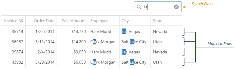
To make the search panel visible, set the searchPanel.visible option to true.
See Also
selectedRowKeys
Allows you to select rows or learn which rows are selected. Applies only if selection.deferred is false.
Array<any>
You should specify the field that provides keys to access a row using its key. For this, use the key option of the Store that underlies the dataSource. The whole data object is considered the key if no key field is specified. However, we recommend specifying the key option to prevent duplicating the selection.
See Also
selection
Configures runtime selection.
A user can select rows in a single or multiple mode. In multiple mode, a user can select all rows at once. To disable this feature, assign false to the allowSelectAll.
By default, once a user selects a row, the data source is instantly notified about it. This may lower the widget performance if the data source is remote and the user is allowed to select all rows at once. In this case, we recommend making the selection deferred.
See Also
selectionFilter
Specifies filters for the rows that must be selected initially. Applies only if selection.deferred is true.
This option also allows you to obtain filter expressions for the currently selected rows. Note that if all records are selected, the selectionFilter value is null. If there are no selected records, the value contains an empty array.
See Also
showBorders
Specifies whether the outer borders of the widget are visible.
showColumnHeaders
Specifies whether column headers are visible.
See Also
- columns[].caption
showColumnLines
Specifies whether vertical lines that separate one column from another are visible.
showRowLines
Specifies whether horizontal lines that separate one row from another are visible.
sortByGroupSummaryInfo[]
Allows you to sort groups according to the values of group summary items.
Normally, when records are grouped by a column, the groups are sorted according to the values of this column. In a number of cases, such approaches cannot address your needs, e.g., when you require to sort groups by the number of records in each. For these cases, you can implement sorting according to the values of group summary items. These items are specified in the groupItems array. Assume that you have the following code that specifies three group summary items.
jQuery
$(function () {
    $("#dataGridContainer").dxDataGrid({
        // ...
        summary: {
            groupItems: [{
                column: 'Age',
                summaryType: 'avg',
                name: 'Average Age Group Summary'
            }, {
                column: 'Income',
                summaryType: 'max'
            }, {
                column: 'Tasks',
                summaryType: 'min'
            }]
        }
    });
});
Angular
 <dx-data-grid ... >
     <dxo-summary>
         <dxi-group-item
             column="Age"
             summaryType="avg"
             name="Average Age Group Summary">
         </dxi-group-item>
         <dxi-group-item
             column="Income"
             summaryType="max">
         </dxi-group-item>
         <dxi-group-item
             column="Tasks"
             summaryType="min">
         </dxi-group-item>
     </dxo-summary>
 </dx-data-grid>
import { DxDataGridModule } from 'devextreme-angular';
// ...
export class AppComponent {
    // ...
}
@NgModule({
    imports: [
        // ...
        DxDataGridModule
    ],
    // ...
})
To use these summary items for sorting groups, assign an array of objects to the sortByGroupSummaryInfo option. In each object of this array, specify the summaryItem field. This field determines the summary item to be used for summary-based sorting. In the following code, three objects form the sortByGroupSummaryInfo array. In each object, the summaryItem option determines different summary items using different values.
jQuery
$(function () {
    $("#dataGridContainer").dxDataGrid({
        // ...
        sortByGroupSummaryInfo: [
            { summaryItem: 1 }, // determines the maximum income item using its index in the "groupItems" array
            { summaryItem: 'min' }, // determines the minimum tasks item using its aggregate function
            { summaryItem: 'Average Age Group Summary' } // determines the average age item using its name
        ]
    });
});
Angular
<dx-data-grid ... >
    <dxi-sort-by-group-summary-info
        [summaryItem]="1"> <!-- determines the maximum income item using its index in the "groupItems" array -->
    </dxi-sort-by-group-summary-info>
    <dxi-sort-by-group-summary-info
        summaryItem="min"> <!-- determines the minimum tasks item using its aggregate function -->
    </dxi-sort-by-group-summary-info>
    <dxi-sort-by-group-summary-info
        summaryItem="Average Age Group Summary"> <!-- determines the average age item using its name -->
    </dxi-sort-by-group-summary-info>
</dx-data-grid>
import { DxDataGridModule } from 'devextreme-angular';
// ...
export class AppComponent {
    // ...
}
@NgModule({
    imports: [
        // ...
        DxDataGridModule
    ],
    // ...
})
After that, set the groupColumn option for objects in the sortByGroupSummaryInfo array. This option identifies the column that must be used in grouping in order that a particular summary-based sorting setting be applied. If you have omitted this option from an object, the sorting setting specified by this object will be applied regardless of the column used in grouping.
jQuery
$(function () {
    $("#gridContainer").dxDataGrid({
        // ...
        sortByGroupSummaryInfo: [
            { summaryItem: 1, groupColumn: 'Tasks' }, // applies sorting only when records are grouped by the "Tasks" column
            { summaryItem: 'min', groupColumn: 'Last Name' }, // applies sorting only when records are grouped by a "Last Name" column
            { summaryItem: 'Average Age Group Summary' } // applies sorting regardless the grouping column
        ]
    });
});
Angular
<dx-data-grid ... >
    <dxi-sort-by-group-summary-info
        [summaryItem]="1" groupColumn="Tasks"> <!-- applies sorting only when records are grouped by the "Tasks" column -->
    </dxi-sort-by-group-summary-info>
    <dxi-sort-by-group-summary-info
        summaryItem="min"
        groupColumn="Last Name"> <!-- applies sorting only when records are grouped by a "Last Name" column -->
    </dxi-sort-by-group-summary-info>
    <dxi-sort-by-group-summary-info
        summaryItem="Average Age Group Summary"> <!--  applies sorting regardless the grouping column -->
    </dxi-sort-by-group-summary-info>
</dx-data-grid>
import { DxDataGridModule } from 'devextreme-angular';
// ...
export class AppComponent {
    // ...
}
@NgModule({
    imports: [
        // ...
        DxDataGridModule
    ],
    // ...
})In addition, you can set an ascending or descending sort order for each summary-based sorting object using its sortOrder option.
See Also
stateStoring
Configures state storing.
State storing enables the widget to save applied settings and restore them the next time the widget is loaded. These settings include filtering, sorting, column order and width, selection, grouping, and others. Assign true to the stateStoring.enabled option to enable this functionality.
See Also
summary
Specifies the options of the grid summary.
A summary is a grid feature that provides a synopsis of data contained in the grid. A summary consists of several items. A summary item displays a value that is a product of applying an aggregate function to the data of a specific column.
There are two types of summary in DataGrid: group and total. The group summary is calculated on a group of data, which is segregated during grouping. To specify the items of the group summary, declare an array of objects and assign it to the summary.groupItems field.
The total summary is calculated on all data contained in the grid. To specify the items of the total summary, declare an array of objects and assign it to the summary.totalItems field.
tabIndex
Specifies the number of the element when the Tab key is used for navigating.
The value of this option will be passed to the tabindex attribute of the HTML element that underlies the widget.
twoWayBindingEnabled
Specifies whether to enable two-way data binding.
Two-way data binding ensures that the UI tracks changes made in the data source by a 3rd-party component, and vice versa. This way, the widget and its data source stay synchronized. If you implement two-way data binding in the widget on your own using the cellTemplate and/or editCellTemplate options, make sure to set the twoWayBindingEnabled option to false.
width
Specifies the widget's width.
This option accepts a value of one of the following types:
Number
The width in pixels.String
A CSS-accepted measurement of width. For example,"55px","80%","auto","inherit".Function
A function returning either of the above. For example:JavaScriptwidth: function() { return window.innerWidth / 1.5; }

 Select one or more answers