JavaScript/jQuery CardView Types
CardClickEvent
The argument type in the cardClick event.
Used in:
CardDblClickEvent
The argument type in the cardDblClick event.
Used in:
CardHeaderItem
Configures card header items.
You can reuse default items and include custom items.
CardHeaderPredefinedItem
Specifies predefined items for the CardView card headers.
CardHoverChangedEvent
The argument type in the cardHoverChanged event.
Used in:
CardInsertedEvent
The argument type in the cardInserted event.
Used in:
CardInsertingEvent
The argument type in the cardInserting event.
Used in:
CardPreparedEvent
The argument type in the cardPrepared event.
Used in:
CardRemovedEvent
The argument type in the cardRemoved event.
Used in:
CardRemovingEvent
The argument type in the cardRemoving event.
Used in:
CardTemplateData
Properties of a card content template.
CardUpdatedEvent
The argument type in the cardUpdated event.
Used in:
CardUpdatingEvent
The argument type in the cardUpdating event.
Used in:
ColumnProperties
Configures column properties.
ColumnTemplateData
Properties of a column template.
ContextMenuPreparingEvent
The argument type in the contextMenuPreparing event.
Used in:
ContextMenuTarget
Specifies the element that should be clicked to invoke the context menu.
dxCardViewEditing
Configures editing.
The UI component can allow a user to add, update and delete data. To control which of these operations are allowed, use the allowAdding, allowUpdating and allowDeleting properties.
dxCardViewFieldInfo
Information about the field.
EditCanceledEvent
The argument type in the editCanceled event.
Used in:
EditCancelingEvent
The argument type in the editCanceling event.
Used in:
EditingStartEvent
The argument type in the editingStart event.
Used in:
EditingTexts
The texts displayed when editing a card.
FieldCaptionClickEvent
The argument type in the fieldCaptionClick event.
Used in:
FieldCaptionDblClickEvent
The argument type in the fieldCaptionDblClick event.
Used in:
FieldCaptionPreparedEvent
The argument type in the fieldCaptionPrepared event.
Used in:
FieldTemplateData
Specifies a custom template for the field.
FieldValueClickEvent
The argument type in the fieldValueClick event.
Used in:
FieldValueDblClickEvent
The argument type in the fieldValueDblClick event.
Used in:
FieldValuePreparedEvent
The argument type in the fieldValuePrepared event.
Used in:
FocusedCardChanged
The argument type in the focusedCardChanged event.
Used in:
HeaderPanel
Configures the header panel.
InitNewCardEvent
The argument type in the initNewCard event.
Used in:
OptionChangedEvent
The argument type in the optionChanged event.
Used in:
Paging
Configures paging.
Paging allows the UI component to load data in portions instead of loading it simultaneously. To enable paging, set the paging.enabled property to true.
Users can switch between pages and change paging settings using the pager or they can scroll the pages. Paging settings apply with any scrolling mode.
PredefinedToolbarItem
Specifies predefined items for the CardView toolbar.
RemoteOperations
Notifies CardView of the server's data processing operations.
Server-side data processing improves the UI component's performance on large datasets. When the server does not implement particular operations (and/or the corresponding remoteOperations fields are false) they are executed on the client. Note that the UI component may send queries to the server while executing a client-side operation.
false. Other operations are always client-side.See Also
SavedEvent
The argument type in the saved event.
Used in:
SavingEvent
The argument type in the saving event.
Used in:
SelectionChangedEvent
The argument type in the selectionChanged event.
Used in:
SelectionConfiguration
Configures runtime selection.
| Name | Description |
|---|---|
| allowSelectAll | Allows users to simultaneously select all or current page cards (depending on selectAllMode). |
| mode | Specifies the selection mode. |
| selectAllMode | Specifies the mode for selecting cards. Applies only if selection.allowSelectAll is |
| showCheckBoxesMode | Specifies when to display card selection checkboxes. |
A user can select rows in a single or multiple mode. In multiple mode, a user can select all rows at once. To disable this feature, assign false to the allowSelectAll property.
See Also
ToolbarItem
Configures toolbar items.
The toolbar can contain the following elements as items:
Predefined controls
Predefined controls appear on the toolbar depending on whether a specific CardView feature is enabled. The following table illustrates the dependency:Control Name Image Prerequisites addCardButton 
editing.allowAdding is true columnChooserButton 
columnChooser.enabled is true searchPanel 
searchPanel.visible is true selectAllButton 
selection.allowSelectAll is true and selection.mode is 'multiple' clearSelectionButton 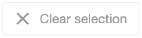
selection.mode is 'single' or 'multiple' If you need to customize a predefined control, add an object to the items[] array. This object must contain the control's name and properties that you want to customize. If a control does not need customization, simply include its name in the toolbar.items[] array.
The example below customizes the Column Chooser button, adds an Add Card button, and enables the corresponding CardView features:
jQuery
index.js$(function(){ $("#CardViewContainer").dxCardView({ // ... editing: { allowAdding: true }, columnChooser: { enabled: true }, toolbar: { items: [ "addCardButton", { name: "columnChooserButton", locateInMenu: "auto", location: "after" }] } }); });Angular
app.component.htmlapp.module.ts<dx-card-view ... > <dxo-card-view-editing [allowAdding]="true"></dxo-card-view-editing> <dxo-card-view-column-chooser [enabled]="true"></dxo-card-view-column-chooser> <dxo-card-view-toolbar> <dxi-card-view-item name="addCardButton"></dxi-card-view-item> <dxi-card-view-item name="columnChooserButton" locateInMenu="auto" location="after"> </dxi-card-view-item> </dxo-card-view-toolbar> </dx-card-view>import { BrowserModule } from '@angular/platform-browser'; import { NgModule } from '@angular/core'; import { AppComponent } from './app.component'; import { DxCardViewModule } from 'devextreme-angular'; @NgModule({ declarations: [ AppComponent ], imports: [ BrowserModule, DxCardViewModule, ], providers: [ ], bootstrap: [AppComponent] }) export class AppModule { }Vue
App.vue<template> <DxCardView ... > <DxEditing :allow-adding="true" /> <DxColumnChooser :enabled="true"/> <DxToolbar> <DxItem name="addCardButton" /> <DxItem name="columnChooserButton" locate-in-menu="auto" location="after" /> </DxToolbar> </DxCardView> </template> <script setup lang="ts"> import { DxCardView, DxEditing, DxColumnChooser, DxToolbar, DxItem } from 'devextreme-vue/card-view'; </script>React
App.jsimport CardView, { Editing, Toolbar, Item, ColumnChooser } from 'devextreme-react/card-view'; // ... function App() { return ( <CardView ... > <Editing allowAdding={true} /> <ColumnChooser enabled={true} /> <Toolbar> <Item name="addCardButton" /> <Item name="columnChooserButton" locateInMenu="auto" location="after" /> </Toolbar> </CardView> ); }IMPORTANTCardView does not display controls missing from the items[] array. Ensure that this array includes controls for all enabled features.DevExtreme components
jQuery
You can use DevExtreme components as toolbar items. Set the widget property to specify the component that you want to use and configure the component's options:
index.js$(function(){ $("#CardViewContainer").dxCardView({ // ... toolbar: { items: [{ widget: "dxSelectBox", options: { // SelectBox properties are specified here } }] } }); });Angular
You can use DevExtreme components as toolbar items. Declare a
dxi-card-view-itemelement to add a supported component:app.component.htmlapp.module.ts<dx-card-view ... > <dxo-card-view-toolbar> <dxi-card-view-toolbar-item> <dx-select-box> <!-- SelectBox properties are specified here --> </dx-select-box> </dxi-card-view-toolbar-item> </dxo-card-view-toolbar> </dx-card-view>import { BrowserModule } from '@angular/platform-browser'; import { NgModule } from '@angular/core'; import { AppComponent } from './app.component'; import { DxCardViewModule, DxSelectBoxModule } from 'devextreme-angular'; @NgModule({ declarations: [ AppComponent ], imports: [ BrowserModule, DxCardViewModule, DxSelectBoxModule, ], providers: [ ], bootstrap: [AppComponent] }) export class AppModule { }Vue
You can use DevExtreme components as toolbar items. Declare a
DxItemelement to add a supported component:App.vue<template> <DxCardView ... > <DxToolbar> <DxItem> <DxSelectBox> <!-- SelectBox properties are specified here --> </DxSelectBox> </DxItem> </DxToolbar> </DxCardView> </template> <script setup lang="ts"> import { DxCardView, DxToolbar, DxItem } from 'devextreme-vue/card-view'; import { DxSelectBox } from 'devextreme-vue/select-box'; </script>React
You can use DevExtreme components as toolbar items. Declare an
Itemelement to add a supported component:App.jsimport { SelectBox } from 'devextreme-react/select-box'; import CardView, { Toolbar, Item } from 'devextreme-react/card-view'; // ... function App() { return ( <CardView ... > <Toolbar> <Item> <SelectBox> {/* SelectBox properties are specified here */} </SelectBox> </Item> </Toolbar> </CardView> ); }Custom controls
To use a custom control, specify a template.

 Select one or more answers