JavaScript/jQuery CardView - Toolbar
Configures the toolbar.
items[]
Configures toolbar items.
The toolbar can contain the following elements as items:
Predefined controls
Predefined controls appear on the toolbar depending on whether a specific CardView feature is enabled. The following table illustrates the dependency:Control Name Image Prerequisites addCardButton 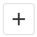
editing.allowAdding is true columnChooserButton 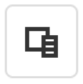
columnChooser.enabled is true searchPanel 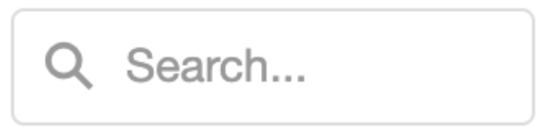
searchPanel.visible is true selectAllButton 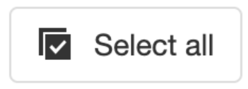
selection.allowSelectAll is true and selection.mode is 'multiple' clearSelectionButton 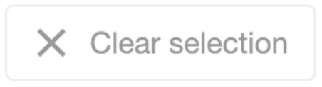
selection.mode is 'single' or 'multiple' If you need to customize a predefined control, add an object to the items[] array. This object must contain the control's name and properties that you want to customize. If a control does not need customization, simply include its name in the toolbar.items[] array.
The example below customizes the Column Chooser button, adds an Add Card button, and enables the corresponding CardView features:
jQuery
index.js$(function(){ $("#CardViewContainer").dxCardView({ // ... editing: { allowAdding: true }, columnChooser: { enabled: true }, toolbar: { items: [ "addCardButton", { name: "columnChooserButton", locateInMenu: "auto", location: "after" }] } }); });Angular
app.component.htmlapp.module.ts<dx-card-view ... > <dxo-card-view-editing [allowAdding]="true"></dxo-card-view-editing> <dxo-card-view-column-chooser [enabled]="true"></dxo-card-view-column-chooser> <dxo-card-view-toolbar> <dxi-card-view-item name="addCardButton"></dxi-card-view-item> <dxi-card-view-item name="columnChooserButton" locateInMenu="auto" location="after"> </dxi-card-view-item> </dxo-card-view-toolbar> </dx-card-view>import { BrowserModule } from '@angular/platform-browser'; import { NgModule } from '@angular/core'; import { AppComponent } from './app.component'; import { DxCardViewModule } from 'devextreme-angular'; @NgModule({ declarations: [ AppComponent ], imports: [ BrowserModule, DxCardViewModule, ], providers: [ ], bootstrap: [AppComponent] }) export class AppModule { }Vue
App.vue<template> <DxCardView ... > <DxEditing :allow-adding="true" /> <DxColumnChooser :enabled="true"/> <DxToolbar> <DxItem name="addCardButton" /> <DxItem name="columnChooserButton" locate-in-menu="auto" location="after" /> </DxToolbar> </DxCardView> </template> <script setup lang="ts"> import { DxCardView, DxEditing, DxColumnChooser, DxToolbar, DxItem } from 'devextreme-vue/card-view'; </script>React
App.jsimport CardView, { Editing, Toolbar, Item, ColumnChooser } from 'devextreme-react/card-view'; // ... function App() { return ( <CardView ... > <Editing allowAdding={true} /> <ColumnChooser enabled={true} /> <Toolbar> <Item name="addCardButton" /> <Item name="columnChooserButton" locateInMenu="auto" location="after" /> </Toolbar> </CardView> ); }IMPORTANTCardView does not display controls missing from the items[] array. Ensure that this array includes controls for all enabled features.DevExtreme components
jQuery
You can use DevExtreme components as toolbar items. Set the widget property to specify the component that you want to use and configure the component's options:
index.js$(function(){ $("#CardViewContainer").dxCardView({ // ... toolbar: { items: [{ widget: "dxSelectBox", options: { // SelectBox properties are specified here } }] } }); });Angular
You can use DevExtreme components as toolbar items. Declare a
dxi-card-view-itemelement to add a supported component:app.component.htmlapp.module.ts<dx-card-view ... > <dxo-card-view-toolbar> <dxi-card-view-toolbar-item> <dx-select-box> <!-- SelectBox properties are specified here --> </dx-select-box> </dxi-card-view-toolbar-item> </dxo-card-view-toolbar> </dx-card-view>import { BrowserModule } from '@angular/platform-browser'; import { NgModule } from '@angular/core'; import { AppComponent } from './app.component'; import { DxCardViewModule, DxSelectBoxModule } from 'devextreme-angular'; @NgModule({ declarations: [ AppComponent ], imports: [ BrowserModule, DxCardViewModule, DxSelectBoxModule, ], providers: [ ], bootstrap: [AppComponent] }) export class AppModule { }Vue
You can use DevExtreme components as toolbar items. Declare a
DxItemelement to add a supported component:App.vue<template> <DxCardView ... > <DxToolbar> <DxItem> <DxSelectBox> <!-- SelectBox properties are specified here --> </DxSelectBox> </DxItem> </DxToolbar> </DxCardView> </template> <script setup lang="ts"> import { DxCardView, DxToolbar, DxItem } from 'devextreme-vue/card-view'; import { DxSelectBox } from 'devextreme-vue/select-box'; </script>React
You can use DevExtreme components as toolbar items. Declare an
Itemelement to add a supported component:App.jsimport { SelectBox } from 'devextreme-react/select-box'; import CardView, { Toolbar, Item } from 'devextreme-react/card-view'; // ... function App() { return ( <CardView ... > <Toolbar> <Item> <SelectBox> {/* SelectBox properties are specified here */} </SelectBox> </Item> </Toolbar> </CardView> ); }Custom controls
To use a custom control, specify a template.
multiline
Specifies whether the toolbar arranges items into multiple lines when their combined width exceeds the toolbar width.
Note that if you set the multiline property to true, you cannot use the following item properties:
visible
Specifies whether the toolbar is visible.
This property can have one of the following values:
| toolbar.visible | Description |
|---|---|
| true | The toolbar is always visible. |
| false | The toolbar is always hidden. |
| undefined | The toolbar is visible only if there are items to display. |

 Select one or more answers